Technical analysis figures are trading patterns that are repeated over and over again and allow the trader to predict further price movements. In most cases, technical analysis models can simply be found on the price chart, without any additional tools. Of course, all technical analysis figures can (and should) be confirmed by support and resistance levels, trend lines, trading indicators, etc., and this tells us that all figures have a serious basis and many years of experience of traders. All we have to do is learn to find these repeating patterns on the chart and learn how to use them to make our profits.
Content
- The “Flag” figure in technical analysis of charts: how to correctly use the “flag” figure in trading
- Pennant pattern in technical chart analysis: trend continuation pattern
- Double top (pattern M) – a reversal pattern in technical analysis
- Double bottom (W pattern) – a pattern of changing a downtrend to an uptrend
- Head and shoulders – technical analysis reversal pattern for an uptrend
- Reverse head and shoulders – reversal technical analysis pattern for a downtrend
- Bowl with handle – trend change pattern in technical chart analysis
- An inverted bowl with a handle is a pattern of changing an uptrend to a downtrend
- Rectangle – consolidation (sideways movement) figure in technical analysis
- Rectangle pattern in a bullish (upward) trend
- Rectangle pattern in a bearish (downward) trend
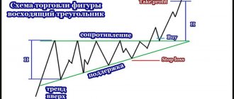
- Ascending triangle – reversal pattern
- Descending triangle – reversal pattern
- Trend continuation patterns
- Reversal patterns or trend reversal patterns
- Uncertainty figures or two-sided figures
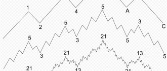
Triangles
No less popular topic than head and shoulders and rectangles. The triangle is formed based on simple market logic: market volatility decreases before a further breakthrough. And this process is very easy to formalize in the form of a simple triangular figure.
From the same figure, such pennants are formed - a kind of triangle with a “handle” in the form of long candles.
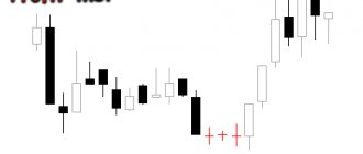
Let's say this is a flag for a downward trend.
The figure, in this case, is working out further movement along the trend.
The opposite situation occurs with an uptrend.
The trend continues. Don't forget to measure the range of motion.
And here is an example of a symmetrical triangle, beautiful and pleasant. Two inclined lines converge towards each other. In this case, it is difficult to say the direction of the breakdown, but we know that it will definitely happen. After all, in the market, one side always prevails, sellers or buyers.
Here is a breakdown according to the general trend.
Ascending Triangle
In this figure, one side of the triangle acts as resistance. However, the question is what will happen when the price approaches the very top of the triangle. Will she be able to break through the resistance or, on the contrary, will she roll back?
The forum has detailed statistics on practicing such figures, links to which are at the end of this article. In the meantime, you should be prepared for a breakout in either direction. This is how the triangle worked in this case.
Descending triangle
The opposite situation. The bottom side of the triangle acts as support. As a rule, the price breaks through such a line and moves on, however... not always. If the support is too strong, the reversal will be in the other direction.
In Forex, it is easier to exploit such figures, since you can place a breakout order in the desired direction and go about your business. In binary trading, you need to wait for a breakout, then a small rollback, and only then open a trade in the direction of the breakout.
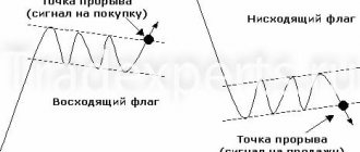
The “Flag” figure in technical analysis of charts: how to correctly use the “flag” figure in trading
The technical analysis pattern “Flag” is a very common and simple pattern found in trending price movements and signaling the end of a pullback and subsequent continuation of the trend.
If you know the rules for using the Flag pattern, you can consistently make good profits from trend trading. Let's figure it out. The flag is formed in wave-like trend price movements, namely during pullbacks against the trend. The correct flag (the one that is formed according to all the rules of technical analysis) consists of three parts:
- Strong trend movement – flagpole
- Update the previous high (for an uptrend) or the previous low (for a downtrend)
- Price rollback – the Flag figure itself
In an uptrend diagram it would look like this:
For a downward trend, the flag figure will appear during upward rollbacks (i.e., these are price rollbacks against the current trend):
Updating previous lows or highs is a must for the Flag technical analysis pattern!
The maximum or minimum has been updated - we are waiting for the flag to form. If, after the formation of a flag, the price does not update previous peaks or troughs, then the trend is most likely over, and there is no point in looking for the correct “Flag” figure. The flag itself can consist of a couple of candles, as well as complex and lengthy rollbacks against the trend. Typically, traders determine the upper and lower borders of the flag, but use only one border - the breakdown of which will continue the trending price movement, so the second border is auxiliary and serves solely to visually determine the flag.
For an uptrend, we will only be interested in the upper border of the flag, and for a bearish trend, only the lower border. A breakdown of these boundaries indicates the end of the rollback and the continuation of the trend. It is after the border is broken that it is worth opening a deal for 3-5 candles. The time frame can be any - from M1 to W1 (weekly time frame).
Let's look at the Flag technical analysis figure in practice. For an uptrend, the flag will look like this:
For a flag to work best, the flagpole must consist of a good trending price movement, preferably without small pullbacks. In a downtrend, the Flag pattern will look like this:
To better identify the pattern, during a rollback it is better to wait for a slight price fluctuation in the direction of the trend and set the main border of the flag based on this fluctuation - this will allow you to avoid mistakes when forming complex rollbacks. The flag itself will always be directed against the trend, but signals from it will always be in the direction of the current trend.
Long Island
There are a number of patterns that are classified as strategic tools for long-term trading. One of these figures is the “long island” - a section of the chart surrounded by gaps on both sides .
To make sure that you have “arrived on an island”, you need to identify a number of its signs:
- Uneven and wide gaps located at different levels;
- U-shaped chart of trading volume;
- To analyze the situation, you should choose time intervals of 2-3 months (at short intervals this figure is not used at all).
Long Island Pattern
Some features of trading when an island is discovered:
The possibility of obtaining a high result is higher in the case when the island was formed at the beginning of a new trend;
If the second gap is completely closed, then it is better to refrain from trading, and if other small islands are found inside the island, wait for the trend to end.
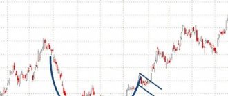
Pennant pattern in technical chart analysis: trend continuation pattern
A pennant is a technical chart analysis pattern that indicates the continuation of a trend.
It looks like a horizontal triangle, within which price fluctuations gradually fade. A correct pennant results in a breakout of the upper boundary in an uptrend and the lower boundary in a downtrend. A pennant in a bullish trend looks like this:
For a bearish trend the situation is completely opposite:
As in the case of the “Flag”, the Pennant is formed after strong trend impulses - these impulses are called “Flagstaff” or “Pole”. It is imperative to take into account the updating of peaks or troughs - i.e. A pennant can only be viewed in trending price movements.
If we look at the pennant on a real chart, then in an uptrend it will look like this:
In a bearish trend (downtrend), the pennant will look like this:
It is not uncommon for traders to first trade the “Flag” technical analysis figure, and then trade the “Pennant”. This is due to the fact that during price formation it is not entirely clear what kind of pattern is being formed. The flag is formed many times faster than a pennant, but since... Both of these figures have the same data and differ only in shape, then no one will forbid you to receive double profit.
If we compare the “Flag” figure and the “Pennant” figure, we get the following:
- Both figures are formed after the appearance of the “Flagpole” - a strong trend impulse in price
- Both patterns can only be viewed after updating the previous high (in an uptrend) or the previous low (in a downtrend)
- Both patterns are trend continuation patterns
- Trades are opened when the border is broken in the direction of the current trend
Express lines
Is a reversal pattern. It is formed by a gradual shift of the trend line at a certain angle and with increasing speed.
Essentially, these are trend lines that divide the price movement into symmetrical parts.
Formation of the “speed lines” pattern
The starting point is the peak of the previous trend. The vector of speed lines can be determined by drawing an auxiliary line from the reference point to the resistance line. Then this segment needs to be divided into smaller sizes - 2/3, 1/2 and 1/3 of the length of the main line. Next, you need to draw three straight lines through the points on the auxiliary line. These are the “high-speed lines” .
A break of the third line can be a buy signal when an uptrend is reversing, or a sell signal when a downtrend is reversing. ✅
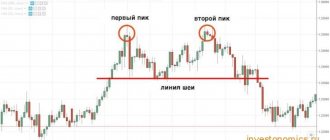
Double top (pattern M) – a reversal pattern in technical analysis
A double top is a technical analysis reversal pattern that indicates the presence of a strong resistance zone that the price cannot break through.
After this figure appears, the upward trend changes to a downward trend. There are times when instead of two tops three tops are formed, but, in fact, this is the same pattern, only the bulls tried to break through a strong resistance zone three times. A double top occurs after bullish trends at the very top. Several variants of the “Double Top” can be considered:
- The first top is higher than the second - a strong reversal pattern
- Both tops are at the same price level
- The second top is slightly higher than the first - a weaker, but still working reversal pattern
- The technical analysis model itself will look like the letter “M”
Do not forget that we do not have specific support and resistance levels, but there are support zones and resistance zones.
It is also worth paying attention to candlestick patterns that often form at tops. The lowest point located between the two peaks is called the "neck" or "neck level". Accordingly, the distance from the neck level to the second top is the approximate distance that the price will travel after the pattern is triggered and the trend changes to a downward one. If we look at the “double top” technical analysis model on the price chart, it will look like this:
The best point to open a trade will be the moment the “neck line” is broken, but do not forget that this is also a zone (support zone), so there are two options for opening a trade:
- The trade is opened immediately after the neckline is broken - a riskier method
- The trade is opened after the candle closes, which has broken through the neckline - the risks are minimal, but it is worth considering that part of the movement may be lost
As for this example, the second top formed the Absorption candlestick pattern - a reversal pattern indicating a change in the current trend. This is another sign that the price will reverse sharply. By the way, it was also possible to trade “absorption” - open a deal immediately after the formed pattern, and only then open a deal according to the rules of the “double top” model.
Saucer shape or rounded bottom (Rounding Bottom)
A rounded bottom or saucer is a reversal pattern that clearly shows the weakening of the current trend. This pattern is traditionally used on medium- and long-term time frames, from several months to several years.
The rounded bottom that forms on a stock chart is very saucer-like and somewhat reminiscent of a mug, only without a handle. The long-term nature of this pattern is explained by the absence of an obvious trigger that would clearly signal the completion of the formation of the figure (for a mug, this role is played by the handle).
Double bottom (W pattern) – a pattern of changing a downtrend to an uptrend
A double bottom is a technical analysis figure that is a mirror image of a “Double Top”.
That is, the model indicates the end of a downward trend and the beginning of an uptrend. In this case, the price hits a strong resistance zone, which it cannot break through, and after two (sometimes three - triple bottom) attempts, the trend changes to upward. All other formation conditions are exactly the same as for the “double top”. A double bottom is formed as follows:
- The model will always be at the very bottom of a downward trend (the model does not form in sideways)
- Both depressions will be approximately at the same level
- If the second “bottom” is higher than the first, then this is a strong pattern
- The distance from the neckline to the second depression will be approximately equal to the distance that can be expected in an uptrend after the pattern is triggered
- Trades are opened: 1) immediately after the neck line is broken; 2) after closing a candle that broke through the neckline
On a price chart, a double bottom looks like the letter “W”:
To confirm the model you should use:
- Levels and zones of support and resistance
- Japanese candlestick reversal patterns
- Indicators indicating a possible trend reversal
Saucer
“Saucer (umbrella)” is a reversal pattern and is rare. It can serve as the beginning of an uptrend and a downtrend (inverted saucer or umbrella).
Saucer and inverted saucer patterns
The “saucer” is formed when market volatility is low: the price gradually reaches a bottom or peak, and then also gradually turns in the opposite direction.
Opening positions is recommended upon completion of drawing the figure: at the moment when the price closes above the edge of the saucer.
Head and shoulders – reversal pattern of technical analysis
Head and shoulders is a technical analysis pattern that consists of three tops and signifies the end of an uptrend.
The pattern is formed at the tops of a bullish trend. If we consider this model of technical analysis in more detail, we get the following:
- The first top (left shoulder) is formed as part of a normal uptrend at the resistance level
- The second top (head) is higher than the first and is formed after the breakdown of the previous resistance level. The price rises until it hits a new resistance level (zone)
- The third peak (right shoulder) is lower than the second, which means the upward trend is over and you should prepare for a price reversal
All tops are formed at support and resistance levels.
Very often you can observe symmetry between the first and third peaks, which are formed at the same levels. If the right shoulder has formed lower than the left, then this indicates the emergence of a strong reversal pattern - we should expect a stable downward price movement. The head and shoulders pattern literally shows us the transition from an uptrend to a downtrend. A trade is entered when the neck line is broken - the line indicating the lowest point of retracement after the formation of the left or right shoulder begins. Everything here is the same as with the “double top” model - you can open a deal when the level is broken, or you can wait until the breakout candle closes and only then enter the market for sure.
On the price chart, the “Head and Shoulders” technical analysis model will look like this:
The height of the Head and Shoulders technical analysis pattern will indicate the distance that the price is likely to travel in a downtrend after the reversal pattern has fully formed.
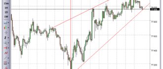
Wedge
The wedge is a reversal pattern. It is formed at price highs and lows between two converging support and resistance levels.
The “wedge” resembles a “triangle” figure. The main difference is the tilt of the figure in one direction.
The breakout of the wedge is considered to be the price moving in the direction opposite to its slope.
The “wedge” can be ascending or descending.
Rising wedge
Essentially, a “rising wedge” is a series of rising highs and rising lows. Unlike a normal uptrend, the swing range of a rising wedge decreases . The dynamics of the market situation ends with the formation of a bearish trend.
Rising wedge
It is believed that with a rising wedge, good conditions are created for selling: it is better to open a short position at the moment of breaking through or wait until the price rebounds from the lower border.
Descending wedge
The direction of the descending wedge is diametrically opposite to the direction of the ascending wedge. The pattern is formed as a result of successively lower peaks and lows (simultaneously with a decreasing range of fluctuations).
Can occur as a result of bullish and bearish trends.
Descending wedge
The emergence of a descending wedge signals good conditions for buying assets: both for an upward trend and for a downward one. The signal to open a long position is the moment when the price breaks the upper level of the wedge.
Reverse head and shoulders – reversal technical analysis pattern for a downtrend
Reverse head and shoulders is a technical analysis model that completely repeats all the features of the head and shoulders pattern, but appears after downtrends and signals the end of a bearish movement and the beginning of a bullish trend.
Simply put, this is a mirrored reversal pattern. As in the previous case, “Reverse Head and Shoulders” consists of three depressions:
- Depressions form at support and resistance levels
- The first depression (left shoulder) indicates the continuation of the trend
- The "head" or second bottom updates the previous low
- The third depression (right shoulder) forms higher than the “head” depression, indicating the end of the downtrend and the beginning of the bullish trend
- The strength of the model depends on the position of the shoulders - models are considered strong where the right shoulder is formed higher than the left
- Trades are opened upon a breakdown of the “neck” level - the maximum point formed during the formation of the left or right shoulder
The height of the “reverse head and shoulders” pattern will indicate the distance that the price will likely move up after the formation of the reversal pattern is complete. On a price chart, the inverse head and shoulders looks like this:
Crest
Often a situation arises in the market when, immediately before a fall, the price rises very sharply or, conversely, falls. This pattern can often be found in the stock market. It's called a "comb".
The “ridge” can be of two types: ascending and descending.
An “ascending ridge” resembles the Latin letter J. For an ascending ridge to occur, the following must happen: a sharp jump in price, consolidation (a so-called saucer is formed) and another sharp jump.
Rising ridge
Ridge on the chart
A “descending ridge” occurs in the opposite situation: a sharp drop in price, consolidation and a sharp drop again.
Both peaks in the ridge pattern should be at different levels. Otherwise, it may turn out to be other models such as “bowl with handle” or “double top”.
Bowl with handle – trend change pattern in technical chart analysis
To make charts easier to understand, technical analysis figures are often given funny names.
“Bowl with Handle” is one of them. It would seem that what does a bowl with a handle have to do with trade, but, as it turned out, it is the most direct. The figure highlights the section of the chart where the downtrend changes to an uptrend - this is the bowl. The change in trend can be traced by the troughs and peaks - the troughs stop updating, and the peaks, on the contrary, begin to update each other. The first price rollback in an emerging uptrend acts as a handle - confirmation that the downtrend is over and bulls are now ruling the market. The upper “borders” of the bowl are located at the level of support and resistance, but we will be interested only in the left border, because a breakdown of this border will mean the continuation of the trend.
Traders also very often open on a breakout of the “handle” - a price rollback against an upward trend movement. Here the conditions for entry are exactly the same as when trading the “Flag” or “Pennant” patterns - the upper limit of the set rollback channel is broken - we open a trade up.
The bottom of the “bowl” can look like a depression or a consolidation (our example). It is important that the uptrend that has begun is visible, during which a pullback has formed - the handle of the bowl.
Gaps
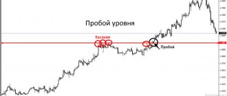
A common pattern, especially common in the stock market. A “gap” occurs when there is a large gap between the closing price of one day and the opening price of the next .
During periods of increased market volatility, intraday gaps can also be observed.
In the chart below you can see a number of gaps formed over several months.
Gaps formed over several months
Gap trading is a fairly simple system for buying stocks short or long . You need to find stocks that are gapping relative to the previous day and watch them in the first hour of trading. Then you need to determine the trading range: breaking the upper limit of this range is a signal to buy, going down is a signal to go short.