Technical analysis figures are a graphical representation of the market situation. They are also called patterns.
A pattern is any repeating element. The term is used in various fields such as art, philosophy, economics, etc.
In trading, patterns are the main, most common patterns of price behavior. By recognizing patterns and how they occur, traders can predict how prices will change in the future. As a result of such observations, the method of technical analysis arose. It is widely used in trading on stock markets and exchanges, including Forex.
In this article we will analyze the classic patterns of technical analysis: we will explain the logic of their formation using specific examples, tell you what they mean and share techniques for understanding them correctly. ✅
Types of technical analysis patterns
Technical analysis figures can be divided into three types:
- Figures signaling a change in trend are reversal patterns;
- Figures that warn of the continuation of a trend after some stop are continuation patterns;
- Bilateral patterns, the detection of which indicates a possible price movement both up and down.
There are also a number of basic terms used in chart reading techniques:
- Trend movement is the expressed direction of market movement. If the candles are long, then buyers control the market. Short candles, on the contrary, indicate weak purchasing activity.
- A pullback is a price movement against the trend. If the candles are long, this means that the pressure against the trend is increasing, and if they are short, the upward trend is likely to continue.
- Pivot points are swing peaks or points on the chart where price makes a reversal. These points help to understand what trend the market is in. So, if the price makes high highs and lows, this means that the market is in an uptrend, if lower, it means it is in a downtrend.
How effective are graphical analysis figures?
From the very beginning of technical analysis, the largest analysts used exclusively figures on the chart in their forecasts. At the same time, many traders have achieved significant success in trading without using any other structures.
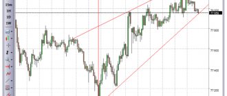
It should be understood that it is extremely rare to see an ideal construction on a real MT4 chart. In most cases, these will not be beautiful, clumsy models.
For better performance in trading, it is worth considering three factors:
- High time frame.
- Technical analysis levels are usually used as an additional filter.
- A line chart for beginner traders helps identify patterns.
Double top & Double bottom
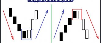
“Double top” and “double bottom” are trading patterns that indicate a change in trend.
A “double top” (like a “double bottom”) consists of three parts: the first peak, the second peak and the neck line.
Double top
This pattern is formed when the price reaches a new peak, goes down, and then reaches the top again, but cannot break through the high of the previous peak. Then the chart drops again, reaching below the neck level (local minimum).
A breakout of the neckline may mean high seller activity and, as a result, a further price decline.
The bottom line is that the bulls are no longer able to maintain the upward movement of the trend, as a result of which the price begins to decline. The occurrence of two lows, where the next one is lower than the previous one, leads to a downward trend.
“Bulls” and “bears” are the generally accepted designations for market participants. Bulls make money from rising prices, and bears make money from falling prices.
When a double top occurs, selling assets is recommended. But be careful: not all cases of the appearance of this pattern lead to a decline in the market . If the double top is in a strong uptrend, then the price will likely continue to rise.
Double top in an uptrend
It is also recommended to evaluate the distance between the peaks of the chart: large distances indicate that a large amount of time has passed since the previous peak. This means that many traders will start selling from this level .
Large distance between peaks of a double top
A double bottom is a mirror image of a double top. This pattern can be seen when, during a downward trend, the price reaches another minimum, then goes up and goes down again, but does not overcome the already reached value.
A breakout of the neck level, in this case, indicates a likely price increase in the near future.
double bottom
Triple bottom
This pattern looks like three depressions, which are located approximately at the same level: the bottom line of the figure passes through the two maximum points located between them.