Why do people come to trade in financial markets? Obviously, to make money .
Market analysis. those. the ability to predict price dynamics in the future is the basics and a necessary condition for making money on the stock exchange. Understanding where the price of an asset is moving, traders adjust their tactics and choose the right moments to enter and exit the market. And, as a result, they close transactions with a profit.
To make money in the financial market, you need to be able to research it
There are two main ways to analyze financial markets: technical and fundamental. The latter is based on the fact that there is always a reason for a price change: economic, political, natural disasters, etc. In technical analysis, the emphasis is on price and it is believed that it is the only thing that matters .
Therefore, for traders who make money on price changes, technical analysis is extremely important. Unlike long-term investors who will benefit more from the fundamental. ✅
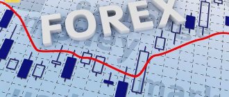
Today we will talk about technical analysis and why it is needed. What is technical analysis?
Technical analysis is the study of price patterns for a particular asset based on past price changes under similar circumstances.
Technical analysts look at historical price information to identify recognizable and repeatable patterns. These models are then used to help traders correctly determine market conditions , as well as possible entry and exit points.
There are many different ways to conduct technical analysis: pattern charts, candlestick patterns, indicators
In this article, we will analyze from scratch the essence of technical analysis, the foundations on which it is built, and how to learn how to use it in trading. Everything you need to know about technical stock analysis for dummies is simple and clear. ✅
What is technical analysis for dummies and why is it needed?
Technical analysis is a method of predicting the future movement of prices on the foreign exchange market or on a securities exchange, based on previous indicators.
Technical analytics tools take into account a large amount of diverse data over different periods of time (from cost to volume). This information is used not only at the current moment, but also makes forecasts for changes in quotes in the future.
It helps novice traders determine the existing trend, its movement, as well as the optimal windows for opening orders.
Brief history of appearance
The primary foundations of technical market analysis were developed back in the 17th century. and were used in trading on Dutch commodity exchanges. Joseph de la Vega was one of the first to take up TA. In the 18th century Japanese rice seller Homma Munehisa invented a technique that later became known as “Japanese candles.”
Early technical analysis studies were based only on graphical information. Charles Dow began developing statistics using basic charts, which eventually became the basis for forecasting and technical analytics. The Dow Theory still works today.
At the beginning of the 20th century. Ralph Nelson Elliott, William Gann, Richard Wyckoff and others joined the study of stock market statistics, whose inventions are used in modern digital analytics to this day.
What does TA study?
The basis for analyzing the situation on the exchange market is dozens of tools that allow the trader to make assumptions about the future behavior of prices.
There are the following methods for this:
Types of graphs or figures that are displayed on them.- Establishing a trend, flat, support and resistance lines, channels, levels.
- Patterns or patterns that represent standard combinations that form on a price chart.
- Japanese candles.
- Indicators and oscillators.
- Trading strategies.
- Risk management system.
Works or doesn't work
To answer this question, you need to understand what technical analysis of the Forex market is and why it is needed. It is used to predict asset price movements based on previous lot behavior charts.
Analysis tools can be support and resistance levels, candlestick charts, indicators of various types, volumes and market phases. Based on this, we can say that the analysis works for those who know how to read charts and identify trends.
However, the exchange can be susceptible to the actions of speculators who inflate the value out of nothing. Therefore, experienced experts recommend supporting technical analytics with news and economic trends.
History of technical analysis
Technical analysis is one of the oldest trading concepts. It has been around ever since there were markets driven by supply and demand .
The oldest tool of technical analysis is the KASEN method, which is better known among us as “Japanese candlesticks”, developed by Japanese rice traders in the 18-19 centuries.
Technical analysis developed rapidly at the beginning of the 20th century. The prerequisites for this were the publications of The Wall Street Journal editor Charles Dow, who at the end of the 19th century published a series of articles about the securities markets.
The basic postulates that underlie modern technical analysis were laid down at the end of the 19th century.
At that time, technical analysis was also popularized by Ralph Nelson Elliott, the founder of the famous Elliott wave theory, William Delbert Gann, the founder of Gann's angle theory, and Richard Demil Wyckoff, who was the first to suggest that the market is best viewed as a single system.
In the first half of the 20th century, when statistical calculations of huge amounts of data were not yet available, technical analysis was limited to charts . But in the second half of the century, computer technology began to actively develop, which contributed to the improvement of technical analysis and the emergence of new tools and methods.
Why is it so popular among traders: pros and cons
Like all analytical methods, technical analysis has advantages and disadvantages.
The positive aspects include:
- You can use various tools to obtain analytics. The use is justified both in the foreign exchange and stock markets.
- Charts allow you to analyze different time periods - the time frame can be set from 1 hour to several decades.
- Different tools are used for different markets, which can take into account specifics.
- The methods are based on what is happening in the current period.
- The data obtained reflect the situation that arose immediately at the time of the operation.
Weak sides:
Analytics is subjective. The opinions of 2 traders may differ significantly.- The received data notifies about the likelihood of an event occurring, but does not claim that it will happen.
- Technical analysis for beginners and experienced traders is based on mathematical calculations, which require skills and abilities.
- For forecasting, it is important to take into account the relevance and reliability of information.
Let's sum it up
Using TA methods, a trader can conduct an in-depth analysis of the market situation . He has many different tools in his arsenal. All of them, both graphical and mathematical, are designed to solve specific problems. They can be easily combined with each other, expanding the trader’s capabilities, reducing the risk of loss and increasing his chance of profit.
The main postulate of technical analysis states that it is impossible to make a decision using only one tool . Data from one instrument should be supported by data from one or two other instruments belonging to different groups.
Basic principles of TA
Technical analysis includes charts, drawing up and analyzing models, oscillatory and simple indicators, strategies and a combination of different techniques and methods. These tools allow you to indicate volumes and price movements.
To correctly make a forecast, you need to know the basic postulates of a technical forecast of the current situation:
- the cost schedule already includes all aspects that influence it;
- price movement is always carried out by trends;
- All situations tend to repeat themselves.
The price takes everything into account
According to technical analysts, it is not worth spending time studying economic and political news. It is believed that important situations that affect the entire world are automatically included in the cost. It doesn't matter how events affect an individual market, what matters is how it appears on the chart.
Prices move by trends
Another axiom of technical analysis is that in the absence of a significant stimulus, the price follows the direction of the trend. Experts say that prices always follow the trend, so traders are advised to trade in the direction of the trend.
History always repeats itself
One of the most common methods of analysis is based on the idea that the situation always repeats itself, i.e. the market moves in cycles. Therefore, it is necessary to pay special attention to previous periods and consider price fluctuations, and use these data to build a forecast for future market behavior.
How to work with time intervals correctly
All methods of technical analysis take into account time intervals, or as they are also called, time frames.
MetaTrader 4 supports the following timeframes:
- M1 - each candle is a price movement within a minute;
- M5 - 5 minutes;
- M15 - 15 minute time period;
- M30 - how the price changed in half an hour;
- H1 — hourly timeframe;
- H4 - price movement in 4 hours;
- D1 - daily chart, actually 24 hours;
- W1 - weekly candle;
- M1 - monthly timeframe.
In this regard, there are also postulates that should be remembered:
- Every candle is important. It is necessary to constantly monitor the chart and monitor the construction of new elements - candles.
- When adopting a ready-made strategy, you should always strictly follow the timeframes. If the strategy specifies analysis of an hourly chart, you should not switch to 15 or 30 minutes, as this will fundamentally change the basis of the chosen tactics.
- The lower the timeframe, the more false signals there are. Yes, traders also work on minute charts, but they have their own rules, and candlestick formations and indicators much more often work differently than on higher intervals.
- The presence of a trend and its direction are determined only by several frames. If there is a trend on the half-hour chart, this does not mean that it will be on the hourly or four-hour chart.
It doesn't matter which frame you prefer to work on.
Data is collected from several intervals and conclusions are drawn from the totality of the information received.
By the way, even scalpers who trade on the youngest intervals often monitor price behavior on large frames, determining the presence and direction of a global trend.
Analysis of the stock market and the Forex market: technical and fundamental, what are the differences
The scientific approach to stock trading distinguishes between technical and fundamental market forecasting. In the first, the emphasis is placed only on price behavior, taking into account its amplitude, direction, speed, cyclicality, etc. In the second, indicators from economic reports are taken into account.
If we are talking about shares, then we should take into account the company’s balance sheet, its working capital, and profit and loss statements. Long intervals are used for forecasting—six months, a year, or even several years.
Technical analysis methods in trading: graphical and mathematical
Mathematical methods are called technical analysis methods that involve the use of indicators - algorithms developed by stock market specialists based on mathematical formulas.
The positive aspects of using indicators include:
- trade dynamics;
- providing extensive status information;
- instruments guarantee an early signal;
- help determine the exact entry and exit points from trading.
The graphical method suggests carefully monitoring the chart and looking for places where patterns are formed that indicate existing trends in the market. The disadvantage is that you can begin to analyze the figure only after it appears completely. The moment to open a deal may be missed. Corrective movements after growth and a further breakout towards the trend are the most common patterns.
Japanese candlestick analysis
Japanese candlesticks are classics of technical analytics on the stock exchange.
They are popular because they display 4 main criteria at once: opening, closing, maximum and minimum in a specified time period. Because of this, they are more convenient to use than the price line on the chart. Based on the figures, patterns are built that foreshadow movements in value in one direction or another. For example, a change in trend, the origin or continuation of a movement.
Indicator analysis
Indicators are tools that are statistical in nature, technical forecasting, and not subjective. They allow stock market specialists to evaluate the quality of charts and create their own buy or sell signals.
There are 2 types of indicators:
- Leaders who anticipate the movement of value and try to predict the future situation. This is necessary during a sideways price jerk, because allows you to identify breakthroughs and the emergence of new trends.
- Lag indicators act as a confirmatory tool. They are useful during trending periods of time. With their help, you can confirm the continuation of a trend or anticipate a reversal in the opposite direction.
Indicators allow you to see the dynamics of trends, volatility and other aspects of the market. But for a more accurate analysis, the data needs to be confirmed with other tools.
Wave analysis of Elliott wave
The Elliott wave technique involves analyzing the financial market based on emerging patterns. According to this theory, there are 8 waves of value movement that are regularly repeated - 5 in the direction of the trend and 3 against it.
The former move in the direction of the main trend. The second ones, accordingly, are corrective to them.
Volume Analysis
Volume analysis allows you to give an objective assessment of supply and demand, and also understand the mood of traders in the market. Volume research is a fundamental aspect of futures trading because... makes it possible to calculate how interested the market is in the established price level. For this purpose, those values on which the largest number of orders were placed are selected.
Glass
The order book is a table that collects information about the availability of orders from buyers and sellers within a specified time period.
The summary is generated as follows: the tool analyzes the number of submitted applications every second, compiles a table and conducts a comparative analysis. As a result, the trader receives accurate information about the level of supply and demand. This method is suitable for short-term forecasts and quick trades.
Japanese candlestick analysis
When analyzing the stock market, Japanese candlesticks are most often used. The subject of study here is the formation of various combinations of two or more Japanese candles. When predicting stock market price movements, both simple combinations such as “absorption”, “Harami” or “morning star”, which are found very often, are used, as well as complex models that include many candles and confirmation conditions.
Their example is “fortress”, “bearish three-line breakout”, “ending bullish or bearish game with a gap”, etc.
Indicator analysis
As the name suggests, this analytical method involves the use of indicators. The indicators themselves are built on the basis of mathematical and statistical models. They can take into account volumes, duration of trends, weighted average trading indicators, the number and severity of transactions, as well as many other factors. All this is combined with each other, intertwined and built in the form of a certain visual model. Based on their properties, they can be divided into many groups, which I will also discuss separately.
Wave analysis of Elliott wave
This analysis of the technical picture of stock markets is named after Ralph Nelson Elliott, the founder of this field.
After analyzing a huge number of charts, he identified that market fluctuations almost always alternate, taking the form of waves. He divided these waves into correctional and driving. And then I found that most trends include a 5-wave model, where 3 are driving, and 2 are corrective.
Volume Analysis
Previously, this type of technical analysis, at least among participants in the Russian stock market, was avoided, but now it has received fairly wide recognition. Trading volume is the number of transactions completed over a certain period. In the classical form, trading volume is studied using the vertical method, i.e. transactions are analyzed relative to a point in time.
However, there is a cluster or horizontal method, when volumes are considered relative to price levels.
Glass
This type involves analytical work with the stock market book of quotes. The glass is an open auction where, on condition of anonymity, stock market participants offer to buy and sell individual instruments at specific prices. Traders try to track unusual orders during trading, based on this when deciding on a transaction.
However, in the stock market the order book does not always have sufficient information content, since many large orders are formed in the form of so-called icebergs or through special pools.
Trends and their types
All market research techniques include drawing a trend line. There are downward and upward movements of trend lines. The construction of directions is done by eye. To do this, several minimum points are determined, which are successively increased, and connected by a straight line. It is possible to predict price movements on the stock exchange only by combining this instrument with others; applying the trend independently is not effective.
Wave-like trends
As practice shows, trends very rarely form a straight line. Most often they consist of a combination of the highest and lowest levels. On the chart, such movement forms waves. Specialists study the amplitude of their oscillations, at what time intervals they repeat, etc. The data obtained is used to forecast the future direction of the price, the speed of movement and determine the minimums and maximums.
Trend duration
In technical forecasting, trends are divided into short-term, medium-term and long-term trends.
To estimate the duration of a trend, higher time frames are used. The meaning of time periods depends on the type of market. For example, when trading stocks, the intervals correspond to daily, monthly and annual values. On the stock market, it is enough to set 5-15 minutes, 1-4 hours and 1 day, respectively. It follows from this that 1 long trend consists of 2-3 short or medium-duration trends.
Trend lines
The trend line is drawn based on the maximum value values. This helps to determine the trend and predict a reversal. For a downward trend, the straight line is drawn at the top, and for an uptrend, at the bottom. This helps to streamline price movements. It should bounce off the next approach to the line or break through it and go beyond. In any of these situations the trend will be considered complete.
Channels
A channel is considered to be the development of a trend line.
The drawn lines form a closed space. Depending on the position, there are channels going up, down or horizontally on the axis (this is called flat). Trading based on channel indicators continues until its walls are broken. This method has a number of positive aspects - the direction of the trend is clearly visible, the lines serve as price breakpoints, and the shadows that fall from the candles determine the best points for entering trading.
Recommendations and tips
If you think that technical analysis is a crystal ball that will predict market movements, then you are mistaken. You cannot rely only on it in your trading. Because without proper risk management, the best trading strategy in the world will not save you from losing your deposit. However, if you combine technical analysis, risk management and self-discipline, then everything should work out for you.
Weekly tops and bottoms
A weekly top is the highest point a price has reached in a week. A weekly trough is the lowest point reached by a price in a week. These points are useful for determining the levels on the chart from which it is best to open trades.
If you see a bearish setup on the weekly charts, your best bet is to look for short trades over the next week. If you trade intraday, pay attention to daily tops and bottoms.
Opening of the London session
If you are an intraday Forex trader, pay attention to the opening of the London session. This time is very important because it is during the London session that volatility in the market increases and the market begins to move.
We can trade breakouts to catch the breakout movement at the London open. Or we can trade with the trend to fully capture its daily momentum. In any case, pay close attention to the opening of the London session.
The best time to open Forex trades
Would you like to take as much momentum as possible from the price movement? Or would you rather be in the trade before the price starts moving in your favor? Then open trades at the very beginning of the trading day. Because at the beginning of the day, the daily price movement potential has not yet been exhausted, and you have every chance to capture as much of it as possible.
Look at the daily chart. You will notice that the beginning of the day is the best time to enter a trade.
If you trade intraday, try to open your trades early in the trading day. If you are a swing trader, take most trades early in the week.
The magic of the moving average
The moving average is a powerful technical analysis indicator that can improve your trading results. It can help you with finding a trend, determining the best entry points and where to place a stop loss.
How to use a moving average to determine a trend?
If you are sometimes in doubt and don't know what the current trend is in the market, the moving average will help you figure it out. You can use a moving average to determine the direction of the trend.
If the price is above the 200 MA, the trend is upward. Below is downward.
How to catch big trend movements using a moving average?
If you want to take large trends in their entirety, you need to use a moving average and move a stop along it following the price movement. The trade is closed only when the price crosses the moving average.
To take the movement of long-term trends, you can use the 200 MA. For short-term ones, it would be best to use the 20 MA.
Support and resistance
Another important indicator is support and resistance levels. They designate straight lines from which the price bounced off in previous periods. Resistance is drawn at the top; it prevents the price from rising above the set level.
On the contrary, support is drawn at the bottom of the chart and serves as the minimum level for the price; the price cannot fall below it. The situation when the price breaks the line indicates a change in market psychology and the determination of new support and resistance values.
The magic of round numbers
This theory is based on the fact that trend lines are created at round values - 10, 20, 30, 50, 70 and 100. Such indicators are believed to have a psychological effect on traders, forcing them to sell or buy assets.
For example, if the initial price of a stock was $120, then when it drops to $100, most players will start buying them, hoping that the price will not cross the axis with a value of 100, which often happens.
The level acts as support, the price bounces off it and begins to rise again. The opposite situation is also possible, when the price rises and, after a rebound from the round barrier, begins to decline.
Role reversal
Roles change after breaking through support levels. After this, the line that was resistance turns into a supporting axis, and vice versa. This does not apply to cases with a false breakout, when the price tried to go beyond the limits, but could not. In this case, the values will be saved.
Many experts consider this trading strategy to be fundamental, so they always include its forecast. It is believed that the more often the price bounces off the line, the stronger it is, especially for analysis on a large time frame.
Channel of support and resistance
It often happens that the price spins close to the support level and resistance line, without making an exact rebound. This creates a small channel that covers the shadows of the candles. This situation helps to find the optimal points to enter trading and determine expiration.
Basics of Technical Analysis
The basic postulates of technical analysis were described by John Murphy, the author of one of the most famous books on technical analysis, “Technical Analysis of Futures Markets.” Theory and practice".
The most important information in technical analysis is price and trading volume.
Let's look at 4 postulates that reflect the essence of technical analysis.
What is a trend
Adherents of technical analysis believe that prices always change not chaotically, but are subject to certain patterns - trends .
A trend is a unidirectional price movement over a certain period of time.
It represents a graphically depicted area of rising or falling prices.
The trader’s task is to recognize the current trend in time and join it, since it will continue to develop until signs of a reversal in the other direction appear.
“The trend is your friend!” (“Trend is your friend!”)
— Technical Analyst at George Lane.
Trends can be upward, downward and sideways.
- When demand exceeds supply, they speak of an upward trend.
A bull market is when stock prices or the entire market rises over a long period of time.
- If supply exceeds demand, this is a downward trend.
A bear market is when stock prices or the entire market decline for a long time.
- When supply and demand balance each other, a horizontal trend occurs. This means that stock prices are relatively stable, and there is no obvious decrease or increase in prices in the market (no trend). Such periods are also called “flat” or “flat”.
The price takes everything into account
“Price takes everything into account” - adherents of technical analysis believe that all factors that influence the price are already taken into account in supply and demand. Therefore, they are not interested in the reasons for the rise or fall of the price: only the fact of its change is important.
Support and resistance levels
Support and resistance lines are the basis of technical analysis. They are used to determine supply and demand.
Resistance lines connect the highs (tops) of the market. They occur when buyers are unable or unwilling to purchase a financial instrument at higher prices. Selling pressure exceeds buying pressure, and rising prices give way to falling.
One of the important types of resistance lines is resistance levels .
They represent lines parallel to the time axis on the graph. The resistance level acts as a kind of barrier to further price growth, and the probability of breaking through this “barrier” is much less than the probability of rebounding from it.
But if a breakdown of the resistance level does occur, then it becomes a support level.
Resistance level becomes support level
Support lines connect market lows and occur when sellers are unable or unwilling to sell a financial instrument at lower prices.
One of the important types of support lines is support levels . They represent lines that are parallel to the time axis on the graph.
The support level, like the resistance level, forms a kind of barrier, but now the probability of a rebound from this “barrier” is much higher than the probability of its breakdown. If a support level is broken, it becomes a resistance level.
Support level becomes resistance level
Thus, any price always has its own support level and its own resistance level :
- The resistance line prevents the price from rising;
- The support line “supports” the price and prevents it from falling lower.
The main rule of a trader: buy from support levels, sell from resistance levels. If your trading tactics indicate that it is time to buy, but the price has not yet reached the support level, then do not rush to open a position.
Cyclicality of markets
Essentially, technical analysis studies the history of certain events associated with the market. And the main “driver” of prices is the social, mass, emotional mood of its participants. And since people in certain situations tend to behave in a similar way , their behavior is cyclical, which is reflected in the graphs of market movements during technical analysis.
Market participants behave similarly in similar circumstances
Thus, the theory of technical analysis is based on the theory “History always repeats itself.” Analysts assume that if certain types of forecasting have worked in the past, they will work in the future. Thus, it is possible to identify certain cycles of price changes in the market based on human psychology.
From a technical analysis perspective, understanding the future lies in studying the past.
Of course, market development does not always occur in cycles: due to the influence of various external factors, price fluctuations may occur that are not typical for a similar period in the past.
Volumes
Volumes are of great importance only on commodity exchanges and on the stock and securities market. They are not suitable for trading on the foreign exchange market because on Forex there is no accurate information about the amount of currency sold or the volume of demand or supply.
How to read volumes in TradingView
TradingView is a simple histogram, each bar of which indicates volume, and the color corresponds to the candle that has formed at the current moment. The moving average is displayed in blue and passes at a value of 20. This helps determine the presence of a trend in volumes. You can change the custom line value in the software settings.
Other volume sources
Additionally, you can obtain information about volumes from large brokerage firms or experienced brokers who provide statistics on their clients’ trading.
You can also use currency futures orders on the CME exchange, where information is provided in the form of histograms. The higher the volume column, the better for trading this pair. It is not recommended for novice specialists to trade only on volumes - this is a complex process that requires experience and skills. The tool is best used in combination with other methods to determine trends and search for reversal patterns, such as M2 .
Divergence by volume
Divergence is the difference in the performance of 2 indicators or signals. In the case when the trend is moving upward, but volumes are rapidly falling, a divergence has formed in the market, which signals a future decrease in value.
Volumes and figures
The movement of value and volume indicators can create figures on the chart that help predict the further development of the situation. Each picture is equipped with a price turning point. If the volume at this point increases, then the price will definitely change direction. Thanks to this pattern, you can easily determine the future of trends: with increasing volumes, the trend strengthens, and with decreasing volumes, it weakens.
Foreign exchange market movement
The market is in constant motion, and freezes only during the general holidays.
The price of an asset is a visual representation of the ratio of sellers and buyers in the market.
The basic law of economics applies here, according to which, if a product is bought a lot, its price increases, and vice versa, low demand reduces the price.
Accordingly, a large advantage in one direction creates a price movement in one direction, and an approximately equal ratio of sellers and buyers leads to the appearance of a so-called flat.
This is a calm market, during which the price continues to move, there is simply no unidirectional dynamics, and the chart is built within one, often very narrow range.
Types of trends
So, we have found out what a trend is - a directed price movement in one direction, with small, wave-like pullbacks.
Based on this, it is easy to understand that there are two main types of trend:
- Rising or bullish,
- And downward, bearish.
But even here, not everything is so simple.
If we open, for example, a weekly chart and see a bright and strong trend on it, then when we move to a lower frame we no longer find it there, and often we see the opposite picture.
Why is this happening?
The answer lies in the wave-like movement.
The price in a trend never moves strictly in one direction for a long time. Rollbacks occur constantly, indicating a confrontation between sellers and buyers. At some point, the forces of one side are cut off, and the initiative is seized.
On lower frames, we can see the same rollback. It’s just that on the weekly chart it looks like just one candle under construction, but on the hourly chart it is already a full-fledged trend, but in a completely different direction. To somehow systematize these disagreements, there are three types of trends in trading:
- Global,
- Secondary,
- And small.
And here you should understand that if globally we have an upward trend, this does not mean that on lower frames we cannot trade downward, since a secondary, and even more so a small trend can be long enough to have time to collect there is a lot of profit from it.
This trading method is called countertrend.
Types of charts
Charts in technical analysis are the main forecasting tool. The favorable outcome of trading depends on their choice and combination with the exchange strategy.
The movement of value is determined by various graphs, but experts identify 3 most important ones:
- candle;
- linear;
- bars.
Candlestick chart
Candles are considered the most effective indicator that displays the full cycle of price movement. First it grows, reaches a maximum point, after which it begins to decrease to the initial level. Studying the behavior and formation of peaks allows you to predict the future behavior of an asset, determine the speed of movement and optimal points for buying and selling.
Line graph
The simplest chart is considered to be a linear one, which combines the closing prices of trading in a specified time period into 1 straight line. Using this technique, you can determine the direction of price movement, and also find a quick trend that will bring profit in the short term.
Bars
Bars are popular among Western traders, so most strategies based on bars are designed for the American stock market.
The interpretation and arrangement of indicators are similar to candlestick analysis, the only difference is in the method of presentation. Thanks to bars, you can determine the opening and closing prices, maximum and minimum values in a specified period of time.
How is the price displayed on the chart?
To analyze and predict prices, it is important to understand the visualization of its movement on a chart . You should also know what a “time frame” is, since all methods of technical analysis take into account quote data over a certain period of time. Let's first look at the timeframes themselves, and then we'll look at how the price movement is displayed on the chart.
Timeframe
This is a term denoting a certain period of time in which price changes and movements occurred. The names of timeframes are the same for all trading terminals - this is an alphanumeric designation of nine time periods. The letter is an abbreviation for the name of the time interval itself (Minute, Hour, Day, etc.), and the number next to it shows its “temporary” value:
Figure 2. List of timeframes
As you can see, working with timeframes is not particularly difficult. There is no need to try to “mindlessly” memorize their names; you just need to understand the logic of their designation . You can select a period in the toolbar of the trading terminal through the built-in panel “ Select TF ” or using the “ Periods ” icon with the TF drop-down list.
Figure 3. Selecting a time frame (TF) in the trading terminal
On the graph, the intervals are separated by vertical dotted lines. It is clear that for each currency instrument, for example, in one working day on H1 there will be 24 (24 hours in a day: 1 hour = 24) such periods. On M15 there will be more such separators:
(24 hours => 24 x 60 minutes = 1440 minutes => 1440 minutes : 15 minutes = 96)
If you are interested, calculate yourself how many hourly periods there will be in 1 day or 1 month.
In the settings of the terminal properties window, you can allow/disable the display of period separators on the chart:
Figure 4. Displaying period separators on the chart
You can call this contextual window by right-clicking on the background of the working chart of the selected currency pair.
Types of price chart
To conduct a qualitative analysis of the foreign exchange market and study its trends, you should choose the most convenient option for displaying prices on a chart . In addition to the trader’s personal preferences, this issue also takes into account the features of the trading strategy he is using. Let's look at what types of charts are “built into” the trading terminal and placed on the toolbar as a separate block:
- Candlestick
We owe its invention to the Japanese, which is why it is called “Japanese candles”. This type of chart, like the bar/bar chart, shows the trader four types of prices, but is visually more pleasing to the eye. Currently, the Japanese Candlestick chart is in great demand among traders and is a successful addition to the technical analysis system. The body of a “bullish” candle is painted white, while the body of a “bearish” candle is black:Figure 5. Japanese candlestick chart
- Linear
Initially, technical analysis involved the use of simple charts. Later they were replaced by a line price display chart, but like a tick chart, it was uninformative. Determining the range of price changes was difficult, preventing a thorough visual analysis. A line graph uses two axes when constructed:a) Vertical – displays the cost.
b) Horizontal – shows duration in time.
A line chart is constructed using points that record the price value at a certain point in time. Its disadvantages include the lack of other useful information, for example, the maximum/minimum price indicator, data on how exactly the price changed over a certain time interval, etc. Without special auxiliary tools, the method of technical analysis on this chart will be of little use. However, even with the necessary tools, it will require more time to study the market state and price behavior.
Figure 6. “Line” graph
- Bar (column)
This type of chart was more often used by stock market players before the advent of Japanese candlesticks. Like “Japanese candlesticks”, it shows four prices at once – “ open», «close», «high», «low" Visually, it is represented by a straight vertical line with small horizontal lines adjacent to it at the top and bottom:a) The dash located on the left is the “open” .
b) The dash on the right is the “close” .
The bar chart is more informative, so technical analysis will be of great benefit here. It will allow for a more in-depth analysis of the market and, accordingly, give better trading results. With its help, you can easily determine the dominant market trend:
Figure 7. Bar chart
Its disadvantages include the inability to quickly analyze the foreign exchange market on a large chart with a large number of bars. The Japanese candlestick chart copes better with this task.
- Tick
Any price movement is measured in “ticks”. On a chart, a “tick” is a point on the chart that is formed, recording a price change. It is impossible to find out by what amount and over what period of time this price has changed on a tick chart. The lack of a time factor and redundancy are its main disadvantages. Regarding the information content, this chart is hardly suitable for conducting high-quality technical analysis. However, it performed well in testing automated advisors.
Click the button to go through a step-by-step guide to “Technical Analysis” and master the strategy in a few simple steps Explore »
Brief overview of technical analysis figures
Figures in technical analysis tend to repeat themselves regularly, which provides opportunities for making forecasts for future periods. However, none can predict the movement of value with 100% accuracy. Thanks to them, you can learn about the speed, highs and lows of prices and build a break-even trading strategy. Experts distinguish 2 types of figures - trend and reversal.
Head and shoulders
This is the most popular figure in technical analytics. The maximum value helps to draw the head, and the intermediate vertices before and after the maximum form the shoulders of the figure. In this case, the shoulders can be of different sizes, the main rule is that the head is higher than them. After determining the figure, a neck line is drawn, which is responsible for the reversal of the trend.
Cup figure
The most unusual figure is considered to be a coffee cup with a handle. It occurs quite often, but not all traders can identify it on the chart, because a lot depends on the visual perception of the picture. There is no need to draw outlines with high precision; the main thing is to determine the outlines and main points of the cup.
Double top regular and inverted
A simple and inverted double top signals a reversal of the current trend. In all aspects, she is considered one of the most reliable figures in the analysis, because does not give false evidence. Peaks are formed during an attempt to overcome support lines or those opposite to it. Having failed, the price reverses direction.
Triangle
The triangle is included in the list of the main figures of technical analytics. It can be downward, symmetrical or upward. This depends on the position of the trend lines on the chart. In 2 other cases, 1 line will be horizontal and act as resistance.
Symmetrical triangle
When a symmetrical triangle is formed, the trend lines converge at 1 point. The meaning of the figure is interpreted as follows: if before it the trend was moving upward, then the exit will be at the top. This indicates that the position is gaining momentum.
You can find the young trader course for beginners (an example of a lesson from the course - video above) at LINK ⇒
Descending triangle
When a descending triangle is depicted, the price breaks through the walls of the figure from below. The lower line forms a support level, so the price is unlikely to decline. This state of affairs is typical for a situation when a trader enters trading with a large number of pending transactions.
Ascending Triangle
This figure is the complete opposite of the previous one, which means that its upper edge is formed by the resistance level. Therefore, the price will begin to decline after rebounding from the line. This suggests that there is a specialist on the market with pending orders who is taking short positions.
Flag figure
In trading, flags are patterns that help prolong the current trend. When the price tends to rise, forming a flag on its way, we should expect a breakout of the resistance line. And vice versa, the supporting line will be broken if a downward trend is formed.
The most profitable figures appear when there is a strong trend on the stock exchange and buyers (sellers) try to fix their own profits. Such actions push the price to go against the trend, and this opens the door to new participants in the market. See an example of trading using Flag + ABC:
Pennant figure
The next figure is a pennant, which is a type of triangle. It signals that the trend will continue in the chosen direction. Unlike a flag, the lines of a pennant converge at one point, forming an angle, rather than running parallel to each other.
Wedge figure
The wedge looks very similar to a symmetrical triangle, which is narrowed and elongated and is directed only in 1 direction - up or down. The figure can also be compared to the tip of an arrow or spear. The figure is used in technical forecasting to refute the current trend or confirm it.
In the case when the price leaves the upper limit, we are talking about a strong trend, and if the lower one, then there will soon be a reversal in direction. To avoid making mistakes in the forecast, it is recommended to use different time periods.
Triple top or bottom
A triple top, or triple bottom, is an analogue of double peaks, but now you need to wait for the formation of a third maximum or minimum point. The signal to open an order is the consolidation of price positions by the support level after the formation of the first 2 peaks.
Saucer figure
The saucer is similar to the shape of a coffee cup, but without a handle. Its appearance serves as a sign of a long-term reversal in value and provides more accurate forecasts over long periods of time.
Price action
Price action trading is a form of technical analysis that relies more on price and chart analysis than on the use of indicators. Price action trading can be based on support and resistance levels, trend lines, candlestick patterns and patterns, as well as the candlesticks themselves.
Candlestick patterns are specific formations that are created by individual or several candles on a price chart. There are two main classifications of candlestick patterns - reversal candlestick patterns and continuation candlestick patterns.
Reversal candlestick patterns are candlesticks that tend to reverse the direction of the current price. Continuation candlestick patterns are candlesticks that tend to continue the price movement in the same direction. Examples of a pattern could be a pin bar, an inside bar, or an engulfing pattern.
Technical analysis patterns are specific formations that are created by overall price action on a chart. Like candlestick patterns, price patterns are also divided into two types - reversal and continuation.
The most reliable reversal chart patterns in trading are: double top, double bottom, triple top, triple bottom, head and shoulders.
Continuation patterns are used to predict the continuation of a general trend. The most popular chart continuation patterns are flags, wedges, and triangles.
The image begins with price movement following a bullish trend line. Suddenly, the trend is interrupted in a bearish direction, which creates a short breakout signal. The price starts to drop. A pin bar appears. As you can see, soon after this the price begins to move up. On the way up, the bearish trend line breaks.
The well-known double bottom reversal pattern is forming. After the price closes above resistance, we expect a price increase equal to the size of the formation.
Reading candles on a chart
Candlesticks help us visualize price movement on a chart. Using them we determine the entry point into the market.
Each candle consists of:
- Opening prices.
- Maximum.
- Minimum.
- Closing prices.
Here are some candlestick patterns that will help us find our entry point:
- Pin bar.
- Outside bar.
- morning Star
You can read more about candlestick patterns in the article Candlesticks in Forex - how to use them in trading?
Pin bar
A pin bar is a reversal candlestick pattern that shows a rebound from lower or higher prices. It is characterized by:
- Little or no shadow.
- The price closes around 1/4 of the candle's range.
- The lower shadow is approximately 2 or 3 times the length of the body.
What does pin bar mean? Let's take the bullish pin as an example.
- At first, sellers took control of the price and pushed it down.
- At the height of the sales, there was buying pressure that forced the price to move up.
- The buying pressure was so strong that the candle closed above the opening price.
External bar
An outside bar is a pattern that consists of two candles, with the second candle completely engulfing the first.
Let's analyze the situation when the first candle is bearish and the second is bullish.
- On the first candle, sellers are still in control.
- On the second candle there was such strong buying pressure that the candle closed above the high of the first candle. This tells us that buyers have completely overwhelmed sellers at the moment.
morning Star
The morning star is a candlestick pattern that forms after a price decline. It shows us that the sellers' power has ended, and now the initiative passes to the buyers.
- The first candle is bearish.
- The second candle has a small range.
- The third candle is aggressive bullish and its size is more than 50% of the first candle.
What does this model mean?
- First, sellers control the market situation.
- In the second candlestick, there is indecision in the market, as the forces of buyers and sellers are now in balance (the range of the candlestick is small).
- On the third candle, the buyers won the battle and the price closed significantly higher than the opening price.
Indicators
Indicators in a technical forecast are a good auxiliary tool. However, they are rarely used separately from other programs. Stock market specialists have developed many strategies that are based on various indicators. With their help, you can track price movement and its volatility from a variety of angles. The main purpose of these instruments is to confirm a trend or reversal.
Oscillatory indicators
This type of analytical tools is most popular among traders. A special conditional scale is allocated for it, which in a standard situation has values from 0 to 100.
The indicators are interpreted as follows:
- if the price value of an exchange commodity approaches 100, it is overbought, so you should expect a fall in value;
- If the price line approaches 0, it indicates oversold conditions, i.e. the price will rise.
MACD
MACD in simple words is the result of simultaneous assessment of the market by 2 different moving averages. The logic of MACD is that the slow moving average shows the long-term market trend, and the short moving average shows what will happen on the trading floor now or in the near future.
If there is a strong difference between these 2 indicators, we can talk about a state of strong overbought or oversold.
RSI
A popular indicator of trend strength, which is used in overbought and oversold situations. Using RSI, you can analyze the strength (weakness) of the current market price state. The indicator is based on the use of closing prices over a set period of time, which results in time-tested performance. As a result, it is used everywhere - for real indices, futures, options, currency pairs.
Stochastic
This oscillator indicator is the most popular all over the world. Its popularity is explained by its operating principle. Stochastic is considered a momentum indicator, i.e. determines the strength of value movement. Thanks to this, traders can determine when a price reversal will occur and when to buy or sell assets. In the case when a strong trend has formed on the stock exchange, and the price reaches its maximum value, we should expect a quick reversal of the trend.
Specialists should monitor overbought and oversold zones and build a trading strategy based on this data.
Intersections and divergences
Crossovers and divergences are another type of signals sent by indicator tools. Divergence is a situation when the movement of the indicator lines and the prices diverge greatly in value. If such a situation occurs on the stock exchange, you should wait for a trend reversal.
However, in trading there is such a thing as hidden divergence, which indicates the continuation of the trend. It’s easy to notice: at this moment on the chart the price should reach the upper minimum, and the oscillator should reach the lower one.
The intersection of the price chart with the oscillator chart during a divergence in different directions serves as confirmation of a trend reversal.
Popular indicators
There are many different indicators in professional trading, but among the whole mass it is worth highlighting those that are used most often.
Accumulation Distribution AD
This tool belongs to the category of volume indicators, where price behavior is compared to trading volumes during a specified period.
Its use is appropriate for indices, stocks and other securities, but it is not suitable for evaluating currency pairs, because On Forex, volumes are not indicated. Based on this indicator, several existing stock market strategies have been built. The interpretation is as follows: as the A/D line tends upward, the power of buyers also increases. A price reversal should be expected after the indicator reaches its maximum.
Average Directional Index ADX
The ADX tool is used to determine the strength of the current trend. The indicator does not determine the direction of the trend, but allows you to judge its strength and the possibility of a reversal. The ADX chart is displayed by 2 lines: positive (+DI) and negative (-DI). The first allows you to track changes in an upward trend, and the second - in a downward trend. The indicator can take values from 0 to 100.
Aroon
This is a trend indicator, the main task of which is to determine the presence of a trend, its direction and the strength of the value direction. Additionally, the tool is used to search for a new trend. The indicator has 2 lines - blue and red.
The first of them is used to indicate the period that has passed since the last maximum price value. And the second highlights the period since the last minimum. Values may change according to the selected timeframe.
You can take a closer look at Arun’s work using the example of a trend reversal. This situation occurs when both lines were in opposite parts of the graph for a long time (blue at the top, red at the bottom), and then intersected. This is the most accurate signal for a change in trend direction.
On Balance Volume OBV
The OBV technical analytics tool is used in trading stocks, indices and other types of securities. To carry out the analysis, you need to take the total volume for the selected period and indicate a positive or negative value of the parameter (depending on the price behavior during this period). After this, the resulting value is added to the initial amount.
If an instrument shows steady growth, it means that the price will also move up. Conversely, if the indicator decreases, the price will fall.
Moving averages
Uniform price behavior is rare on the stock exchange. Most often it moves in waves, peaks or in a chaotic manner. Because of this, it is difficult to identify a trend and determine its properties. To solve the problem, moving averages are used, which display the average price in the selected time period.
Thanks to sliding lines, chaos turns into a smooth, orderly movement, in which it is easy to determine the trend.
Types of moving averages
There are several types of moving averages, the main ones are:
- MA (Moving Average);
- SMA (Simple Moving Average) - simple;
- WMA (Weighted Moving Average) - weighted;
- EMA (Exponential Moving Average) - exponential.
These are the most common lines that are used in most working strategies. Most often, instrument developers indicate what type of moving averages should be used.
Using Moving Averages
Sliding lines are used in trading to identify the following situations:
- determine the trend and its strength;
- find out when the trend will reverse;
- determine the supporting axis and the opposite one.
This tool allows you to quickly determine the behavior of the exchange price: is it rising or falling. For a detailed analysis of the situation, it is recommended to set different time frames, and only then build a forecast.
Which moving averages to use
Many trading strategies for behavior in the market are built on the basis of moving lines. Most of them involve manually controlling the indicators until they occupy the position of the resistance axis (or support line). If it is not possible to play with the values, you can use the standard option - MA 100 or 200. Exchange specialists advise always using this tool when making a forecast.
Trading in the “corridor” or “by levels”
Traders usually begin studying the possibilities of technical analysis with the method of trading by levels. This is not surprising, because this strategy is both simple and profitable. It is preferred by most Forex traders, choosing this method as the main one or complementing other strategies with it.
The essence of such trading is that the price of an asset is determined by a kind of corridor within which it can fluctuate. The boundaries are lines called “support” and “resistance” (they limit the corridor from below and from above, respectively). These restrictions, as a rule, are visible to the naked eye - even if their price breaks through, it returns insignificantly and quickly. More often, a breakdown does not occur at all, and the price fluctuates near the level line.
A trader who knows how to identify moments of breakdown and navigate the situation is able to make big money from this. However, you can reduce risks by trading only inside the corridor - these should be short-term transactions in which profits are formed due to price fluctuations.
Candlestick price action analysis
Techniques for player behavior on the stock exchange often include candlestick combinations. According to statistics, more than 65-70% of exchange trades use robots for charting. This contributes to the fact that many traders carry out purchase and sale transactions without leaving home, all they need is a computer and Internet access.
In this regard, price action strategies have been developed that allow you to track offers in short periods of time. Trades are carried out quickly, but often the amount of profit is minimal.
An example of TA on the stock exchange for traders - how to do it (the entire technological process)
For example, you can take stable shares, which have been trading in the channel for several years. The upper limit is in the range of 148-150 rubles, and the lower limit is 125-130 rubles. At the same time, the sides of the channel are also the axes of support and resistance.
There were moments when the price unsuccessfully tried to exit the channel. In such a situation, a trader could buy shares at the bottom line and sell at the top, earning 18-20 rubles. for 1 piece The profitability of 5-6 similar transactions would be 60-70% profitability.
You can find the young trader course for beginners (an example of another lesson from the course - see the video above) at this LINK ⇒
Level breakdown
Two touches at the cost of the same value within a few points already allows us to build a level there.
There can be a lot of such touches, but sooner or later any level will be broken.
As a rule, a breakout occurs on an impulse, that is, we can observe a large number of candles building near the level, and at some point a sharp push occurs and the price breaks the level.
From the author
Roman Zif
Ask a question to the author
The price going beyond the border is not yet a breakout, since it may turn out to be false, and the traditional rollback in such cases can bring the price back.
The levels can be used in practice in different ways, but in any case, the price approaching this value is a reason to be careful.
Situations when even the strongest trend fades near a level are not uncommon, and a breakout does not mean that the price will continue to move in the same direction.