Geometry lessons for a trader or how to read stock market charts, every trader should know!
Alexander Gerchik’s professional credo is: “You can successfully trade in any markets and any instruments from corn to bitcoin if you know how to read charts . Therefore, to successfully trade on the stock exchange, every trader must know how to analyze a chart.
This is not just a geometric display of market dynamics, but the basis of technical analysis in order to clearly assess the pricing trends of any instrument and forecast price changes. With their help, you can easily determine which positions are stronger - supply or demand.
Learn how to read stock charts so you can really master the trade.
What charts does a trader need for technical analysis:
- linear;
- columnar;
- point-digital;
- Japanese candles;
- histograms.
Some advanced banks, brokers and ace traders are developing new types of pattern charts for trading, but these are fundamental.
Trader charts
Practicing investors constantly use the potential of graphic images and their combination in business. Basic types of infograms allow beginners to obtain the required information about assets.
This is especially true for players who enter into many transactions during the day, because in this case it is inconvenient to analyze data from tables. Making a lightning-fast decision to carry out an operation during a period of active trading is the purpose of charts. And stock price charts fully justify it.
Acquiring the skills to read visual diagrams means effectively improving your trading and getting more chances to make profitable trades. This skill allows you to correctly assess the general trend and reliability of the selected instrument, as well as confirm the validity of the conclusions of fundamental analytics.
In order to prepare diagrams for your trading strategy, use special programs that can add or remove the required information.
Which traders' charts are the most significant?
Bar and line charts are popular among most traders. Americans prefer point-and-digit candlesticks, Europeans prefer bar candlesticks, and Japanese prefer Japanese candlesticks.
Determining a financial instrument
Each chart shows price fluctuations of a single financial instrument. They can be anything. On Forex, these will be currency pairs, for example, dollar/ruble, Swiss franc/Japanese yen, on the stock market – rates of shares and bonds, that is, securities. On the commodity market - prices for oil, precious metals, tea, cotton and all sorts of other things.
The financial instrument is always written in the upper left corner of the chart. Sometimes it is written in full, like here:
But most often a financial instrument is written using an abbreviation. Each instrument will have its own abbreviation. If you don’t want to look for its decryption in the terminal, just google how your instrument is designated on the exchange.
This is how the chart of the euro exchange rate expressed in American dollars is indicated:
Try to immediately understand the principle by which abbreviations are created. Surely there will be some patterns in your segment of the financial market.
For example, in Forex this is often done - the first two letters indicate the country, and the last one - its currency:
- USD – United States + Dollar – United States (American) dollar.
- CAD – Canada + Dollar – Canadian dollar.
- GBP – Great Britain + Pound – Great Britain + pound sterling = British pound.
In the stock market, the first letters or just a few letters of the company name are usually taken to designate securities:
- MGNT – “Magnet”.
- YNDX - "Yandex".
- MSFT - Microsoft.
- AFLT - Aeroflot.
One more moment. In the stock, derivatives and commodity markets, the name of the instrument is always one word. That is, simply “GAZP” - “Gazprom”.
In the foreign exchange market, the name of the instrument is necessarily two words. In the MetaTrader trading terminal they are written together, in some other terminals they can be written as a fraction.
The first word, or the first abbreviation, is the quote base, and the second is the quote currency. The base is what you will actually trade, and the currency is the currency in which the value of the base is expressed.
For example: EURUSD – there are two words here: EUR (euro) + USD (American dollar). If I now start making financial transactions (buying or selling), then I will make them with the euro, because this is the quote base. And the value of the euro will be expressed in American dollars, because the dollar “in second place” is the quotation currency.
Here is a chart of the USD/RUB currency pair. It shows the value of the dollar (base) in rubles (currency):
That's it, we figured out the tools. Go ahead.
Choosing a time frame depending on your trading style
What time frame is best to trade on? Depending on the trader’s goals, the timeframe period can be chosen completely differently.
According to the classics, it is believed that novice traders start with M15 and even M5. Over time, the scale is increased to H1, H4, D. But these are just statistics.
It is possible that someone does not trade at all, but only invests for the long term. In this case, he should look only at daily and weekly quotes. He should not be worried about local ups and downs.
1. Scalping
When scalping, trading is carried out on the shortest time frames M1-M5, since the movement that the scalper takes is minimal. Literally a couple of percentage points. Most often, this trading principle is used in Forex.
2. Day traders
When intraday (trading within a day), small intervals are taken from M1 to H1. In some cases, day traders may move a position overnight if they are confident that they are right.
3. Short term
Slightly longer options for short-term investors. The range from H1 to D is used here. The position is held for the release of a report, some news, or simply catching short-term trends for a few days.
4. Long term
Since positions are opened for a long time, the investor does not specifically choose an entry point within one day. No matter how he opens a position, in any case he expects to earn a lot in the future, so he doesn’t care about plus/minus intraday interest.
Long-term traders use the highest time frames: D, W, M.
There are no universal or profitable time frames. The history of markets knows different traders who made money both in large periods and in the smallest ones.
Determining the timeframe
A timeframe is the time interval over which price changes are displayed. It is usually always indicated next to the financial instrument.
You need to remember that M is minutes, H is hours, D is days, W is weeks, MN is months.
H4 means that the schedule is “four-hour”. That is, every price change that is recorded on it is a change in four hours.
Look, here are two price changes:
If the chart is four-hour, then four hours have passed between these changes.
Let's make sure of this. I move the cursor to the first “break” - it happened at 12 o’clock:
Let me bring you to the second one – it happened at 16:00. That is, just in four hours.
The next “break” will occur in another four hours, that is, at 20.00.
If your chart is displayed in the form of bars or candlesticks, then each bar or each candle will show the price dynamics for the period of time marked on the chart. If the chart is four-hour, then each bar and each candle is the dynamics of the rate for 4 hours.
Here is the dynamics that took place from 12.00 to 16.00.
But - from 16.00 to 20.00.
When we get to Japanese candles and bars, you will understand what they are and why they are needed.
Finding support and resistance levels
The concepts of support and trading level resistance are two of the most discussed attributes of technical analysis. They are used by traders to indicate price levels on charts that act as barriers, preventing the price of an asset from moving in a particular direction.
Support is the price level at which a downtrend can be expected to stop due to concentrated demand or buying interest.
When the price of an asset or security falls, demand for the stock increases, forming a line of support. Meanwhile, resistance zones arise due to interest from sellers when prices rise.
Once an area, or "zone", of support or resistance is identified, these price levels are perceived as potential entry or exit points because when price reaches a point of support or resistance, it will either bounce back from the support or resistance level or break the price level and continue moving in its direction until it reaches the next support or resistance level.
Removing unnecessary elements
Once you have decided on the financial instrument and time interval, you need to make the chart readable. Remove from it all those elements that you do not plan to use.
For example, this chart here has a default grid, a MACD indicator window, and a one-click trading window.
I don't need any of this right now. These elements prevent me from looking at the chart. I right-click on the indicator and remove it.
I right-click on the chart and delete the grid and trading window in one click.
The result is a clean graph that will be much easier for me to analyze.
Example of TA on the stock exchange
This is an hourly chart for Sberbank shares. From the point of view of technical analysis, this stock instrument shows both different technical figures and a change in the direction of a stable trend after the formation of a double top. Thanks to the MACD technical indicator, divergence is clearly visible. Surely, attentive investors also noticed that the stochastic showed technical zones of overheating before most corrective movements.
Adjusting the scale
You need to select the chart scale. But not the one that is convenient for you, but the one that will allow you to “see” the price dynamics.
If your chart is displayed as a line, select display in the form of Japanese candlesticks. That is, so that it would not be like this:
And like this:
The correct scale is the minimum scale at which the rectangles of the candles are visible. If I now reduce my graph, it will look like this:
There is no need to reduce it that much. I zoom in and rectangles appear:
That's it, I'm not bringing it any closer. You can, of course, bring it closer and closer. But then you will not see market dynamics, you will simply see huge Japanese candlesticks:
Where to find quote charts
Real-time quote charts are presented on leading information portals for traders and investors. Among them are sites such as:
- tradingview.com;
- investing.com;
- ru/indicators;
- ru/quotes;
- bcs-express.ru/kotirovki-i-grafiki;
The most convenient service I use is Tradingview.
In our case, the company chosen is Apple. But the service makes it possible to track almost any security and currency pair. If you are interested in what is happening on a particular exchange, then it is not difficult to find quote charts for the instruments traded on it on its official website. For example, you can study the Moscow Exchange asset of interest at the link moex.com/ru/data/
Enable autoscroll and right indentation
By default, most trading terminals have the autoscroll function enabled. It works like this. You rewind the chart “to the past”, but as soon as the price changes even a little, the chart will automatically return “to the present”.
To conduct a market analysis, you sometimes have to go back a few times. And when you rewind like that, and it throws you back, it’s terribly annoying.
Therefore, you can disable autoscrolling during analysis. In MetaTrader it is disabled here:
When it is disabled, you can easily move the chart into the past and, if desired, return to the present.
Another useful thing is the schedule shift. If it is turned on, you will have some free space after the graph.
This is sometimes necessary for technical analysis. For example, to build an equidistant channel and make a forecast about the goals of price movement.
If there is no offset, the quotes will stick to the right edge of the chart and it will be more difficult to conduct technical analytics:
Actually, we have made all the necessary settings, now let's read our charts.
Candlestick analysis (price action)
Price Action involves analyzing candlestick combinations. In this case, each of the candles in the row must meet certain characteristics. This method of technical analysis may indicate a change in trend or the formation of a certain pattern. The most popular are reversal Pin bars, hammers, morning stars, inside bars, etc. Along with this, several simple patterns can cooperate with each other and form more complex technical structures, such as a combination of a pin and an inside bar.
Reading the scales
The bottom scale in any graph shows the time. Time during which the price changed:
The scale on the right shows the price of one unit of a financial instrument.
For example, one dollar costs 0.89811 Swiss francs.
One Gazprom share now costs 226.92 rubles.
Let's move on.
Best Forex Charts - Which Type of Charts to Choose?
The profitability of your Forex trading activity is based on your ability to make the right decisions at the right time. Charts are essential for determining when is the best time to trade and take positions.
Choosing between a line chart, a bar chart, and a candlestick chart is not easy. Are you wondering which Forex chart is best?
In reality, each type of chart provides you with specific information, and sometimes it is necessary to consult multiple types of charts to optimize your chances of making a profit with Forex.
✅Line charts are useful for understanding the overall trend.
✅Bar charts are useful for monitoring market volatility.
✅Candlestick charts are useful for making trading decisions.
EURUSD H1 chart, MetaTrader 5 Admiral Markets Supreme Edition, accessed March 19, 2022.
Please note that all charts shown in this article are demonstrative and do not constitute a trading recommendation. Past performance is not a guarantee of future results.
In general, experienced traders usually use Forex candlestick charts, which give them accurate and technical information about price events.
However, we advise you to try all the available tools to find the one that suits you best. To develop an effective trading strategy and achieve your financial goals, there is nothing better than trying to interpret different charts.
Let's look at the volume
The volume indicator in the stock market is almost always located below the chart. In the Forex currency market, you can additionally connect volume indicators and analyze them.
Trading volume data is visualized through a bar chart.
Let me remind you that in the foreign exchange market volumes are not as informative as in the stock market, because they are ticked there. That is, volume simply records the number of transactions.
If on the stock market I buy shares for 1,000 rubles, and you buy shares for 1,000,000 rubles, then the volume will be equal to 1,001,000 rubles. If we do the same in Forex, the volume will be equal to 2. Because we opened two trades.
Line chart in trading
The line chart is useful for studying open interest and volume indicators. It shows simple price movement.
In the figure, it looks like a solid line that connects closing prices.
Closing prices are indeed the most important, but they are applicable on daily, weekly, monthly or quarterly charts. It is by them that the value of open positions individually and investment portfolios as a whole is determined.
Beginners learn to understand “rulers” in order to track the general trend of increasing or decreasing asset values. But additional information is needed to make decisions; this is not enough.
When analyzing 24-hour market quotes, remember that daily closes will be completely different in the Japanese, European or American markets.
Reading Japanese candlesticks and bars
I already wrote above that you should display the chart in the form of bars or Japanese candlesticks. This is necessary in order to see four prices of a financial instrument for each time interval.
The four prices that are on the market are:
- Opening price is the first price that was at the beginning of the time interval. If you have a daily chart, then at the beginning of the day, if you have a minute chart, then in the first second of the minute. In English, opening prices are designated as “Open”.
- Closing price. This is the last price that was within the time interval. If you have a daily chart, then the last price will be the one that was, say, 23-59-59. Its English name is “Close”.
- Maximum price. This is the highest price value that occurred over a certain period of time. The English designation is “High”.
- Minimum price. The lowest value that occurred during the time interval. In English - “Low” (low).
For example. When Forex trading began in the morning, the US dollar was worth 74 rubles. This is the opening price. When the day ended, the dollar was worth 75 rubles - this is the closing price. During the day, the dollar rose in price to 76 rubles (this is the maximum price) and fell in price to 73 rubles (the minimum price).
Japanese candlesticks and bars give you all this information.
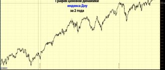
For example, here is a one-minute chart of the Dow Jones Industrial Average. Each candle on it shows price fluctuations within a minute. This one is from 21.33 to 21.34.
But this one is from 21.34 to 21.35.
The "shadows" of the candles show the maximum and minimum values during the time interval. That is, within one minute the price rose and fell to these levels:
And the boundaries of the “body” are the opening and closing prices. That is, in the first second of the minute the price was at the blue level, and in the last second – at the red level.
It's absolutely the same with bars. The stick to the left shows the opening price, the stick to the right shows the closing price. And the “column” itself is the maximum and minimum prices.
This is what our bar-shaped candle looks like:
The chart is analyzed precisely through bars or Japanese candlesticks. Because they immediately show four prices during a time interval. And the “line” always shows only one price.
By default, the line is built using closing prices. This parameter can be changed and a line can be built using opening prices or maximum/minimum prices. But this is pointless, because it will still be uninformative.
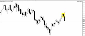
Now the important point. When you read a candlestick chart, look for the "unusual" candlesticks. That is, those who do not have a body or do not have one shadow.
If a candle has no body or its body is very small, this may be a signal of a trend reversal. For example, like here:
In bar format it will look like this:
It looks much worse, with Japanese candles it is a thousand times easier.
If you see a candle without a shadow, it indicates a very strong trend. That is, the market has so much strength that it does not fluctuate at all.
Example:
In bar form it will look something like this:
Recommendation
Be sure to read my article about Japanese candles. Everything there is chewed up and put on shelves.
We have learned to read individual candles and bars, now let's move on to trends - a collection of candles or bars.
How to Learn to Read Stock Charts: The Basics
One way to understand whether it is worth buying/selling assets now or waiting for a more favorable moment in the market is technical analysis.
Technical analysis is predicting prices in the future based on studying them and looking for patterns in the past.
For forecasting based on TA, various combinations of techniques and methods are used. Traders are interested in how and at what speed the price moves, rises or falls, etc. And the most visual way to study changes in the value of an asset is a chart.
Therefore, the essence of technical analysis comes down to studying stock charts. This is a kind of “universal language”, thanks to which traders from all over the world receive information, analyze it and make transactions.
Every day interest in the cryptocurrency market is growing, which means the number of traders is increasing . And you also need to be able to analyze this market in order to compete with other traders and earn money.
Related article: