Support and resistance levels are price areas on the chart where price has ever changed direction. This place always attracts traders, because near the levels there are obvious places for setting stop losses and entering trades. Also, near the levels there are always limit orders of large buyers or sellers.
We can say that a level is a price area in the market where traders consider the price to be overpriced or undervalued depending on the current market dynamics. Therefore, it is always important to pay attention to key levels at which support and resistance have changed roles or there has been a strong price rebound.
The ability to correctly draw support and resistance levels is one of the basic skills that every trader should have. Levels are also the basis for trading strategies and the right risk to reward ratio.
Why are support and resistance levels formed?
What are the levels?
How to draw levels on a chart?
Pay attention to price confirmation of levels
How to avoid mistakes in building levels?
Support and resistance levels and time frames
Plotting support and resistance levels on daily charts
How to use support and resistance levels in trading?
Support and resistance levels: features and nuances
Why are support and resistance levels formed?
To understand why levels form, we must look at the supply and demand curve.
Notice how on the supply curve, the number of units for sale increases as the price increases. To put this in trading terms, the higher the price, the more traders want to sell their positions.
The demand curve, on the other hand, is completely opposite. As the price increases, the number of units for sale decreases. Traders are less willing to make purchases at higher prices.
We can refer to support and resistance levels as the place in the market where traders are more willing to buy or sell depending on current market conditions. This creates a collision zone between buyers and sellers, which often causes the market to change direction.
Conclusion
A strong level is the level from which the player trades, and the place where its critical price is located. The relevance of a level shows us confirmation of a given level close to the current price; if the price bounces off the level, it means that the player is defending this level and it is relevant.
Trading from current levels will help you increase the percentage of positive trades. Your risks in the Forex market will be more clear and the potential of transactions will be greater, because from these levels there is often a strong movement.
These nuances should be taken into account when trading from levels, and then your trading will become more conscious and, very importantly, effective!
Don't forget to leave your opinion about this article in the comments!
What are the levels?
Support level is an area on the chart with potential buying power.
Resistance level is an area on the chart with potential strength for sellers.
When the price breaks a support level, the support becomes resistance.
Conversely, if the price breaks the resistance level, the resistance becomes support.
On higher time frames, support and resistance levels become more powerful.
It is important to pay attention to the nature of price movement from the level:
- If the price immediately reverses from the level into the opposite trend, then this level can be considered significant.
- If the price tests a certain area several times, making a small rollback, most likely, this level will subsequently be broken.
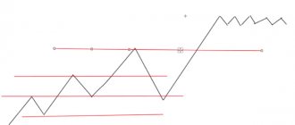
Swing zones are places where price returns to a previous pullback in a downtrend or uptrend. If the trend is not very strong, the price usually tends to return to the border of the previous correction and then continue its movement.
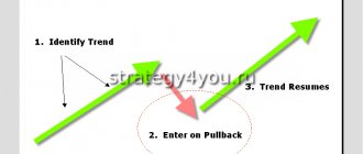
Breakouts and pullbacks
In trading, the moment of breakout and rollback is often used. A breakout is when the price crosses the line. Usually, the momentum of the movement then sharply decreases, a rollback occurs from the line that was broken, and only after this rollback can the price move further in the direction of the breakout.
A pullback is the best time to enter the market. If the trend moves up, after a pullback the price drops to the last resistance level crossed. If the trend is going down, a pullback is the price returning to the support line that was just broken. A rollback can include one candle or several - a lot depends on the time period. It is best to confirm the rollback at higher intervals.
At the moment of the emergence of a new trend, it seems that certain inertial forces are preventing the price from developing. What the real direction of the trend is becomes clear only when the trend is already in full swing. But trends always emerge from a torn market, they are turbulent and difficult to determine at the beginning.
To use a trend in trading, it makes sense to look for pullbacks when the price still feels the influence of the previous price movement, but a new imbalance between bears and bulls is already noticeable, the level is being tested and the price may briefly go sideways. When it begins to move vertically again, copes with inertia and breaks away from the previous level of support/resistance, this signals that sellers/buyers have seized control. But entering the market before a pullback is risky.
A pullback is usually a short movement, but a lot depends on the time period. The price can move back and forth for several candles: when there is no strong determination to breakout, there will most likely be a rollback. Returning the price to a predictable level allows you to open a less risky position compared to the moment the price is already actively moving far along the trend.
Rollbacks can be observed not only near support/resistance; they often occur near technical analysis figures, pivot points, moving averages, etc.
How to draw levels on a chart?
Support and resistance levels are not lines on the chart, but areas or zones. There is no need to try to draw them exactly according to the shadows or bodies of the candles.
Strive to achieve the maximum possible number of price touches on the levels. Typically this will require you to move the level up and down until you find a place where the market will touch that level the maximum number of times.
You don't need to rewind the chart far to note all the important levels. Most often, traders look only at the current monitor screen. Therefore, 100-150 candles will be enough. Most of the levels you will need will be based on price movement over the past six months.
Focus on key levels that are immediately visible. Don't draw too many levels on the chart. Try to keep only the main ones and discard the minor ones. If you find yourself spending too much energy searching for levels, you're probably drawing more levels than you really need.
Dynamic trend lines
Trend lines are used by almost all traders, since it is unrealistic to build a strategy and trade without an idea of the direction of market movement. Any trading system requires an understanding of the prevailing vector of price movement, which is impossible to determine without drawing a trend line.
A trend line is a dynamic support level, which at a certain point turns into a resistance level. If support/resistance levels are built horizontally to cut off false points and unimportant extremes, then the inclined channel in the form of two inclined levels, from which the price bounces, consists of dynamic trend lines.
Trend lines are usually different for time periods. When the direction of price movement changes on a large scale, the trend lines on all timeframes are tested and broken through. The only exceptions are trends that have existed for decades. It may take decades more to replace them.
The smaller the timeframe, the more often you need to monitor and redraw dynamic trend lines.
The True Trendline Forex indicator is often used for this. A simple and convenient tool that draws current trend lines in accordance with the specified settings.
Pay attention to price confirmation of levels
The ability to correctly draw support and resistance levels on charts is directly related to your success in trading. Trying to trade without levels is like trying to drive a car with your eyes closed. It's only a matter of time before you get into an accident.
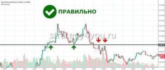
Any price movement at the level signals an increase in demand or supply. The price is clearly reflected in price action patterns, which inform us about the probability of maintaining the level. Let's take a pin bar as an example:
A pin bar at the level tells us that this key support level is in high demand. This is a great example of a level being confirmed by a price action signal.
Consider the following example:
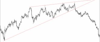
Notice the triangle pattern followed by three support levels. It should be noted that these levels were drawn before the triangle was broken out. Identifying key support and resistance levels should always be your top priority when opening a new chart.
Next we see a bearish price movement, which provided us with a signal to open a short position:
The price confirmed the key support level from which the formation of the triangle began. This is a great place to set a take profit when trading a breakout.
The chart below shows how price reacts to key levels:
What you see above is the heart and soul of price action trading. To be successful in trading, it is not enough to simply find pin bars or inside bars. It is important to read price action at key levels.
Therefore, it is not enough to simply carry out a level. The market should confirm the levels you noted. Otherwise, you will trade what you want to see, and not what is actually happening in the market. Of course, the market won't always test your levels. And that's okay. Don't be afraid to continually adjust your levels. The market is a great teacher and is always willing to show you how accurate your levels are.
It is not enough to simply see a buy or sell signal. We must use the clues the market gives us to gain a statistical advantage and protect our capital. We get these clues by observing how the market reacts to the support and resistance levels we have drawn.
Generating market movement through stop loss orders of a major player
Usually, when exiting with a stop loss, the seller enters almost immediately (we do not take into account price manipulation). That is, the impulse will be strong, and this will generate a movement to go long on the stops of the seller, who will compete with the buyer to enter the position at the price he needs.
This is called a market auction. The presence in the market of two unidirectional players competing for the best price. Only one for entry, and the second for exit from a position. This will be the answer to the question: how is the price movement in the market generated?
How to avoid mistakes in building levels?
Each trader has his own method for drawing support and resistance levels. However, the levels are not always carried out accurately. Some of these problems are due to misunderstanding of levels, since there is nothing more subjective in technical analysis than drawing support and resistance levels.
Sometimes it takes years to train your eye to identify true support and resistance levels, which are the basis of any profitable trading strategy. But it normal. Your goal shouldn't be to play perfect levels the first time. You should try to mark the levels to the best of your ability while remaining open-minded in your analysis. Always allow for the possibility of making a mistake. You should never be too convinced that you are right.
Here's an example where I made a mistake about the key support level. Initially, I used a level drawn through price lows.
It's no surprise why I drew this level: price has repeatedly tested the marked area as support. However, a few weeks later, the price decided to retest the 1.5465 level as resistance. When the testing candle closed, I realized that this level needed to be adjusted.
The market closed above the 1.5465 zone. However, instead of viewing this level as an area of resistance the next day, it closed 17 points lower.
Although this price action was explained as a false breakout, the inconsistent price movement was enough reason for me to question the validity of this level. So I started moving it around to see if the market was actually trying to tell me something.
The 1.5475 level seemed more appropriate to me given the price action over the past few months. Although the difference was only 10 points, I felt much more comfortable using the new level.
One of the most dangerous mistakes is your overconfidence in the reliability of the levels. You should always pay attention to recent market actions that either confirm or refute current levels. The market is dynamic and constantly changing. This is especially true for the forex market since it is open 24 hours a day.
Drawing support and resistance levels is always subjective. If you have the most accurate levels marked, you are more likely to be correct in your prediction. Determining market entry points, setting stop losses and profit targets are also subjective, but these things largely depend on the levels drawn.
Confidence is key to being a successful trader, but when confidence turns into stubbornness, you can be in serious trouble. Be flexible, not stubborn. Try to mark the levels as accurately as possible, always taking into account the price movement. You could be wrong by 5 or even 50 points, but the market will always tell you if you remain open to its signals.
Don't get too carried away with rearranging levels. Sometimes novice traders try to move levels in order to find a price action signal suitable for trading. For example, they move the level to a pin bar in order to open a trade on it.
The chart below shows how the support level has been moved to the tail of the pin bar, however this level does not at all reflect the previous highs of the candles. As expected, the bullish pin bar falls short.
The tail of a pin bar tells us where the level of supply or demand is in the market. But this type of signal is only valid if it occurs at a key support or resistance level.
Characteristics
Support/resistance levels suggest certain properties and characteristics, which are also important to study before using them in trading.
Number of touches
The more times a level has been tested by the price, the more important it is considered. The more often the price has been stopped by support/resistance levels, the more likely a breakout or pullback may be. The mechanics of the foreign exchange market indicate that the more often the price reacted to the support level, the fewer buy orders will remain.
The best time to sell is after price has touched resistance during the first return from a failed breakout.
Levels on higher timeframes
At older time periods (day/week/month), levels become more important. The same goes for trend lines. It is the higher time frames that large players usually look at, who are capable of greatly moving the market.
On small timeframes, levels and lines can also be used, especially when it comes to liquid currency pairs, where even small time periods lend themselves well to technical analysis and its tools.
Touch zones
Pay attention to the number of touches and their quality. The strength of support/resistance largely depends on the magnitude of the pullback. When the price reverses and forms a V, creating new highs and lows, the levels are considered stronger because the market is showing quite strong rejection of the level.
Trend line angle
The following rule works: the steeper the angle at which the trend line passes, the faster and easier it is for the price to cross it (a minimal sideways movement is sufficient for this). Any trend line breaks through sooner or later. And lines with a steep angle intersect more often than those with an angle of less than 45 degrees.
Everything is simple here: trends with a gradual change in value usually last longer than sharp spikes in volatility, which always end in a correction. A breakout of a line with a steep angle does not always indicate a reversal; it may be a rollback with the beginning of a smoother movement.
- Pay attention to our signals + Forex forecasts for each day (it is based on trend lines, channels, levels):
The slope of the line varies greatly depending on the data available and the graph used. When zooming out/increasing, the angle may change.
Arithmetic graphs are different from logarithmic graphs. Despite this, when analyzing the same chart, the slope of the trend lines is necessarily taken into account.
Support and resistance levels and time frames
Let's try to understand the relationship between key levels and timeframes.
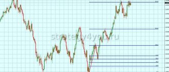
You may have noticed that levels do not always reproduce well across multiple time frames. For example, a level may look good on the daily chart, but on the four-hour chart the level has already been broken.
Notice how well this level holds on the daily chart. All candle bodies in the selected areas are above or below the key level without overlap.
Now let's look at the same level on the four-hour timeframe:
The four-hour chart above shows a retest of this key level as new support. Please note that the body of the candle closed below the level.
At first glance, this looks like a breakout of the level, which could lead to a fall in price. But that's not true. Why? Because the market is interested in supporting this level only on the daily timeframe, and not on the four-hour one.
Let's compare these two timeframes side by side. The level represents the same price on both charts:
The fact that a false breakout occurred on a lower timeframe tells us that the market is interested in maintaining this level only on the daily chart. This means that we must trade at this level not lower than the daily timeframe.
Key Points When Determining Levels
You need to understand three key points:
1. The longer a player takes to gain a position, the larger his position. 2. The larger his position, the more strongly he will defend the critical price level. 3. The stronger the player defends his price, the stronger the level, and the less likely the transaction is to have a negative outcome.
Create a personal account
How can you see traces on the chart that the player is defending the price (position)? This is exactly the situation when it is said that the level is confirmed. Let's look at the graph.
Plotting support and resistance levels on daily charts
Let's talk about building support and resistance levels on daily charts. If you think that there is nothing fundamentally new in this, and that all levels at all time intervals are set the same, then you are deeply mistaken.
If you have been trading price action for a long time, then you already know that daily candles carry a much larger amount of information than candles on H1. If we take each candle as a history of the battle between bulls and bears, then the overall picture will be better visible over a larger period, since we see where the attack of certain forces began.
The candle on H1 can be compared to a small fortress, the capture of which cannot show us the strength of the attackers and defenders. And the candle on D1 is a regional city, the capture of which can play a decisive role in the overall outcome of the war.
If we accept the fact that daily candles really carry more information, then every spike should be important for us, since its tip is the point of preponderance of certain forces.
There are two levels marked on the chart, the blue dotted line is the level at the closing and opening prices, and the red dotted line is the level at the spike.
The blue line mercilessly made its way in all directions, the market did not respect it, since it only tells us about the place where the bears managed to get. Look at the level from the spike. As we can see, the market made a significant upward rebound from it, after which it broke through it, corrected to it and moved down. This is because the spike is the point of preponderance of power, because it was at this point that the bulls began to attack the bears, and this tells us that there are a lot of buyers in this place.
But there are still some points that should be taken into account when building levels:
The market must have a clear direction
The price cannot be in consolidation, or in a small range, as this will not allow the second point to be determined.
Local maximum or minimum
This point should be a local maximum or minimum. In other words, if we have a large spike that stands out, then we should wait for the next candle to close. If another candle blocks the spike, then we will consider the level to be failed.
In the first example, the previous candle overlaps the spike, which does not allow us to set the level correctly. In the second example, the next candle blocked the spike, which indicates to us the weakness of the bears.
The market is constantly moving and at the same time it stops for breaks. It is these stopping moments that we will use to identify the best support and resistance levels, since the latest information about the location of the forces of bulls and bears is important to us.
The marked places are price stopping points, but as we can see, not all of them would indicate to us a good location of a strong and quality level. Therefore, it is necessary to introduce a kind of filter that would help us choose only the best places.
Recent events + history check = good level.
The points where the price made recent stops are marked in red. These places are the latest events in the market. Next, we draw levels at these points and look for rebounds from them. If they exist, and the price rarely breaks through this zone, then we will identify the quality level. If we do not have any price rebounds from the level, then it is better to ignore this point and wait for its confirmation in the future.
Why are recent events so important?
The fact is that the market is constantly in motion due to the fact that bulls and bears alternately take control over it, and those points where these price reversals occur can give us information about the location of certain forces.
The price can stop for two reasons, the first is known to everyone - the market has encountered strong resistance.
The second reason is that the attacking party simply closed their take profit orders, which created a preponderance of power and the market moved in the opposite direction. In other words, there was no strong resistance, there were simply fewer participants in the attack. All that remains is to make a logical conclusion - if the market stopped in a certain place due to the closure of take profit transactions, then we cannot consider this point as the basis for constructing support and resistance levels.
How can you find out that take profit orders were closed in this exact place?
Let's remember our formula: recent events + history check = good level.
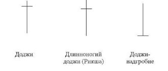
How to analyze candles
The standard approach to candlestick analysis is basic pattern recognition, which does not work in real trading.
Beginners are usually offered a list of candlestick patterns similar to the one below. Each combination has its own unchanging definition. They are advised to remember them so that they can be recognized later on the chart.
However, this is completely useless for a Price Action trader. Thinking of candles as stone combinations is counterproductive. As a result, this leads to huge errors.
Giving each candlestick combination its own definition leads to tunnel vision. When you see one of these on a chart, you expect something specific to happen.
But that's not how candles work. They need to be assessed based on the surrounding candles and many other factors.
To move on to advanced candlestick analysis, you must become familiar with the basic basics. Be sure to read this article if you need to.
Below is a candle commonly called a “spinning top”.
A spinning top means that a price reversal is inevitable. But it can also mean that the price will continue to move in the same direction. Or a temporary stop.
Thinking of candles as simple patterns is the wrong approach. You need to go beyond the model and read the price history.
Price history
Every candle on your chart tells you a story. When you combine these candles together, you get price history.
Reading and understanding price history is vital to successful trading. Because you get the answer to one of the most important questions - who controls the price
?
There are three possible answers to this question: buyers, sellers, or neither.
It is very important to answer this question as accurately as possible. Let's say you are going to open a Short position. Ask yourself who currently controls prices? If your answer is “buyers,” selling is not a good idea.
Let's look at the price.
If you look at the three candles highlighted below, you will understand that sellers control the price:
- All these candles closed lower than they opened.
- All of them created new lows below the low of the previous candles.
- They have large bodies and small upper wicks. Small upper wicks indicate that buyers were not able to raise the price much.
But what does the small candle highlighted in yellow on the following chart tell us? It has a short upper wick, a small body and a long lower wick. It can be called a candle of indecision.
Indecision Candle
Indecision candles occur when neither buyers nor sellers are able to gain and maintain control over price. They appear frequently and, when used correctly, can be very powerful trade signals.
Take a look at this bullish trend (yellow highlight). This is a strong trend with several large bullish candles heading towards the resistance level. Large bullish candles tell us that buyers were in complete control of the price during this period.
When the price reaches resistance, an indecision candle is formed (highlighted with a green background in the image above).
Here's what it means:
Large top wick (blue highlight)
It shows that buyers tried to continue the bullish trend but failed. Sellers took control of the price and lowered it.
Small bear body (green background)
A small bearish (red) body shows that sellers were able to close lower than they opened. Moreover, in the three previous green candles, the closing price was higher than the opening. This all points to buyers losing control.
Small bottom wick (red background)
It shows us that sellers have not been able to achieve much success either. They are not strong enough to completely change the price. However, they have the power to stop further movement of buyers.
So, an indecision candle is formed immediately after strong bullish candles. She suggests that strength has shifted from a bull market to an uncertain market. Sellers have no control over the situation, and neither do buyers.
But there is one more thing that we need to pay attention to - the indecision candle is forming at the resistance level. Let's look at this graph again:
Remember that resistance is a sell area and support is a buy area.
In the image above we see three large bullish candles heading towards the resistance level. And then suddenly the price stops, forming an indecision candle at this level.
This tells us that the selling area is working. When the price approached it, sell orders were triggered, so buyers could no longer continue to move up.
This history of price movement gives us a Price Action trading signal.
How to use support and resistance levels in trading?
A level is a place for a possible entry into a trade. If an additional confirmation signal appears at the level, you can think about opening a position. Stop losses are placed at levels and possible targets for taking profits are determined.
In books on technical analysis and on the Internet you can often read that the more often the price tests a level, the stronger it is. But this is a grave mistake. In fact, the more the price touches a level, the weaker it becomes.
Let's imagine that we have a support level. The price bounces from this level because there are buyers in the market. If the price often returns to the level, this means that buy orders are gradually being executed. And when they are completely filled, who will buy then? Therefore, when there are no buyers left, the price breaks through the level.
It is also very important to observe the size of the candles where the price approached the level. If the candles were large, the price will most likely bounce off the level. If the candles were small and gradually approached the level, forming a triangle figure, a breakdown of the level will most likely occur.
It is important to remember that support and resistance levels are primarily zones, and not exact lines on the chart. Otherwise, you may encounter two problems in your trading: the price does not reach the level and goes beyond it.
When the market gets close enough to a level without touching it, you may miss a trade because you were expecting a trade setup to occur at exactly the level you chose.
In a situation when the price goes beyond the level, you think that there has been a breakout of the level and try to trade the breakout. But this often turns out to be a false breakout.
How to solve these two problems? Very simple. Always think of support and resistance as zones on your chart rather than precise lines.
There are two groups of traders:
- Traders who are afraid of missing out on a deal.
- Traders who want to enter the market at the best possible price.
Traders who are afraid of missing out on a trade enter the market when the price approaches the level. And if there are many such traders, the market will change its direction exactly in this place.
On the other hand, there are traders who want to get the best possible price, so they place their orders a short distance from the level. If such traders become the majority, and traders who are afraid of missing out on a deal become the minority, the price will break through the level and only then change its direction.
You can never know which group of traders will dominate the market at a given time. Therefore, do not forget that support and resistance levels are precisely areas on the chart.
How to set a stop loss when trading from levels?
Never place your feet exactly on the levels or a short distance from them. Because market makers will always be after your stops.
How can you avoid such situations?
First, you can use the ATR indicator and set a stop at the ATR distance from the level, adding the spread size here. Secondly, you can exit the trade only if the price confidently closes behind the level.
Most often, the real movement in the market begins only after market makers have gained maximum liquidity by collecting stop losses from most traders.
Do not open your positions when the price is between levels
A serious mistake many traders make is that they enter the market at a time when the price is far from the level. Such entries require a much larger stop loss and therefore the risk to reward ratio is suboptimal.
But if you let the price get closer to the level, then your stop loss won't be as big.
How to know that a level breakdown will happen?
As we already know, support is an area with potential buying pressure. Therefore, when the price approaches the support level, it should reverse into the opposite trend. But what if this does not happen and the price begins to consolidate at the support level?
This is a sign of weakness as the bulls cannot decisively push the price higher. Or there is strong selling pressure in the market. In any case, this situation does not look optimistic for the bulls, and support will probably not be able to hold.
Trading strategy for trading by levels
Support and resistance levels attract a lot of attention from many traders. Some of them will trade a breakdown, and some will trade a reversal. Therefore, it is inevitable that some of the traders will lose their money.
Mark the areas of support and resistance on the chart:
Wait until the price reaches the level with a directional movement:
Expect a price rollback from the level:
Enter on the next candle after the pullback, placing a stop loss behind the candle that broke the level:
Take profit at the nearest level:
You must understand that this trading strategy is not a grail that will constantly work itself out. You will have profitable and losing trades. And the only thing that will keep you from losing your deposit is proper risk management.
Basic mistakes when working with supply and demand zones
When planning to trade using support/resistance levels, it is advisable to study the most common misconceptions and mistakes. It is always better to learn from someone else's experience than from your own losses.
Common misconceptions and mistakes:
- Levels are always drawn as clear lines that you need to follow - this is far from the case. Not only can a trader draw the levels incorrectly, but even with the correct choice of extremes, the price will not strictly follow the rules. Levels are more areas of interest than clear lines.
- Ignoring subsequent market movements is also common. Having drawn the levels, the trader is sure that this is enough and does not look at further price actions or take into account important changes.
- Marking on the chart all kinds of levels that can be found - traders spend hours looking at dozens of levels, which then do not give any effect. Only really important elements that are part of the trading system need to be plotted on the chart.
- Clear markings of levels along the highs/lows of tails, candle bodies - this is not always the case, often levels pass through the middles of tails, sometimes even candle bodies.
- Going back far into history to build – this makes no sense. It is advisable to choose adequate intervals that correspond to the type of trading and the selected timeframe.
Support and resistance levels: features and nuances
Let's conduct a small test on your understanding of support and resistance levels:
- The more often support and resistance are tested over a short period of time, the stronger they become. (True False)
- You should set your stop loss below support and above resistance so that it is not hit by price. (True False)
- You should take positions near support because it offers a favorable risk-to-reward ratio for your trades. (True False)
Let's now look at these questions in more detail.
The more often support and resistance are tested over a short period, the weaker they become
In most trading articles you will read that the more often support and resistance are tested, the stronger they become. But this is not true because the more times support and resistance are tested, especially over a short period of time, the weaker they become. And that's why.
Support exists because there is potential buying pressure around a certain price level. This buying pressure could be institutional investors, retail traders, smart money, etc. So what happens when price tests a certain level multiple times? Gradually all orders are executed.
Eventually, when all these orders are filled, there will be no one left to buy, and that's when the support breaks. This means that the more often support and resistance are tested, especially over a short period, the weaker they become. Why am I writing about a short period? Because it is unlikely that new orders will appear so quickly.
The multi-year high is a significant level to pay attention to
Here are a few reasons why this happens.
Traders in losing positions hope to break even
Multi-year highs represent extreme optimism in the markets as most traders and investors make profits. But, as you know, the price cannot rise forever. Eventually it must stop or change direction completely. When this happens, many traders close their long positions.
However, not all traders will do the same. Some will continue to stay in the market, hoping that the price may break higher, bringing them even greater profits.
But when the market drops even lower, they will regret not selling sooner because they are now incurring losses. They hope the market can retest the highs so they can exit their trades at breakeven.
Bearish traders want to short the market
For bearish traders, multi-year highs provide an opportunity to short the market at a "high price" because they can use the highs to set their stop loss. Therefore, when the price approaches multi-year highs, interest from bearish traders will increase.
Momentum traders enter the market for a breakout
Momentum traders buy the breakout when the price rises above a certain level. These could be range breakouts, swing zones, resistance levels, etc.
If the price moves beyond multi-year highs, it will attract the attention of traders on different time frames.
This is because whether you are a day trader, swing trader, long-term trader, multi-year highs will be visible on your timeframe and charts regardless of whether you are bullish or bearish in the market.
If you are bearish, you can use it to place a stop loss above the high. If you are bullish, you can buy the breakout and place stops below previous multi-year highs.
Support and resistance are areas on your chart, not lines
I will share my story with you. In my early days of trading, I used to think that my support and resistance levels were the best and the market would respect them to every point. But it didn't take me long to realize that my support and resistance levels were continuing to be violated, and I believed that they were being broken.
That's why I traded the breakout. Often the price quickly made a reversal in the opposite direction, and my positions were closed in stops. I would look at the graphs and ask myself, “What the hell went wrong?” And that’s when I had an epiphany. I realized that support and resistance are not lines, but areas on my chart. That's why …
Typically there are two groups of traders in the market:
Traders with a fear of missing out on a position enter their trades when the price approaches a support level. And if there is enough buying pressure, the market will turn around in this place.
On the other hand, some traders want to get the best price, so they place orders at support lows. And if enough traders do this, the market will reverse around the support lows.
However, you never know which group of traders will control the situation at the moment. So support and resistance are areas on your chart, not lines.
Support and resistance levels represent a significant area on your charts
You may be wondering, "What's the difference between price and value?"
Price is what you pay, value is what you get. If you go to the supermarket and buy 1 apple for $1, that's the price you pay. And the value you get is an apple you can eat immediately without having to grow an apple tree or pick the fruit yourself.
In other words, the price you pay must be "cheaper" than the value you receive, otherwise the transaction will not be worthwhile. What does this have to do with trading?
Well, you can open your trades at any random price level on the chart, but that doesn't mean you will make a profit. Just like how you don't get much value when you pay $50 for an apple.
How do I find significant areas? These may not necessarily be support and resistance levels. These are often areas where potential buying pressure could push the price higher, such as towards a support level.
It is also not guaranteed that the support will hold, but if it does, the price will soon move back up and return to “fair value”.
You can also use trend lines, moving averages, etc.
When price breaks support, it may become resistance
There are two reasons for this.
Unprofitable traders hope to break even
Support is an area where potential buying pressure can intervene and push the price higher. However, support may not be permanent.
When it breaks, traders who are long will be in the red. Smart traders will cut their losses and move on. But stubborn traders will hold on to their losses and hope the price returns to their entry price so they can break even.
This group of stubborn traders creates selling pressure at their entry price when they exit their positions, and if there are enough of these traders, support becomes resistance.
What moves the market
Let's understand what moves the market. The market is driven by initiative or so-called market orders. Stop losses will also be market orders (this is a limit order, which, when activated, turns into a market order).
Let's go back a little and see how the price behaves when the level is broken. When a buyer's level is broken, the movement will be generated by the stop losses of this buyer (selling long positions) and the market orders of the entering sellers.
The larger the buyer's accumulated position, the stronger the movement on his stops should be. When the seller's level is broken, the movement will be generated by sellers' stops (buying out short positions) and market orders from buyers.
The stronger the seller's level, the better the movement will be. This needs to be taken into account when setting goals. Let's look at a picture that will explain to you why you need to keep the price above the level when it breaks out.
Let's start with the fact that each daily bar is the average daily volume that our buyer or seller absorbed. If the position takes 2 weeks to gain, what happens if the player exits immediately after leaving the range? A huge momentum in which this player will not win, but lose.
Let's look at this situation using the example of a seller who needs to buy back his shorts, locking in profits on sales immediately.
In order to make a profit at the average price of a position set, at least a gradual decrease in price is necessary. The price must decline within a few days for the seller to lock in his position at a profit.