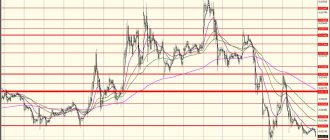
EURUSD chart from TradingView
Technical Summary - Widget from Investing.com Russia.
Online economic calendar from Investing.com Russia, a leading financial portal
Live Chart: Tools
The first is the live chart itself; detailed instructions for using it are at the bottom of the page, under the video.
Like the markets themselves, live charts and tables operate Monday through Friday
On weekends, when there is no trading, you can work with rand and crypto indices from Binary and Intrade
Economic news
Below the live chart on the right is a table of economic news. News with 3 "heads" always affects the market, be very careful with them. The table presents actual data (Actual) , previous (Prev.) and Forecast .
If the forecast diverges greatly from the actual data when news comes out, the market often explodes with a strong reaction. You can trade it, but it’s wiser to skip it and enter a little later, when passions have subsided. You can read more about this in the Schools website.
Technical signals
To the left of the news there is a table of technical signals. It is a mechanical system based on 20 indicators that indicates the direction of the market. Accordingly, the instructions Actively Buy and Actively Sell indicate trends - upward (hence the recommendation to buy) and downward. The table allows you not to litter the chart with similar indicators, because it will show the direction of the market anyway.
Community Outlook
The latest table (Community Outlook) allows you to study what the retail market is currently inclined to do (data aggregated from almost 60 brokers). Let’s say, if 85-90% of the market bets on EURUSD, it is quite possible to expect a reversal, because this is the basis of market dynamics - if there are all buyers (even in the retail segment), then there are no sellers and vice versa.
It also allows you to enter against the crowd and use a variety of related strategies. By hovering your mouse over the desired asset, you will see the overall market sentiment as a percentage, or you can evaluate it directly using the color indicator. Short (short) are transactions for a decrease in price, Long (long) - for its growth. Columns Avg. Short (Long) Price - where the crowd thinks the price will go from its current value (indicated in the Current Price column).
Basics of working with a live schedule
Advanced version of live chart
Live chart: rules of use
Why is our schedule so lively? Once live (online, live) means that quotes are displayed in real time. Moreover, the platform on which the chart is made is implemented in HTML5, no wretched Adobe Flash. Therefore, the schedule is as accurate and without delays as possible.
Well, in general, this chart is the development of Rostov programmers from Tradingview, which went into the world and there is definitely something to be proud of. After all, they are used even on the website of the Chicago Mercantile Exchange - CME.
Basic principles of TA
There are three main principles that are taken into account when analyzing changes in market quotes in the stock market. The first speaks about market efficiency, the second about the trend direction of prices, and the third about the fact that patterns are bound to repeat themselves. Now about each in more detail.
The price takes everything into account
The meaning of this theory is that all information entering the stock market is instantly taken into account in the value of the asset. Therefore, it makes no sense to predict it relative to news flows: you need to abstract from fundamental conditions and focus on the past dynamics of market prices.
Prices move by trends
The idea here is that stock markets move exclusively within trend movements. Moreover, if a trader sees a growing trend on the weekly chart, it means that it will prevail over the one that appeared on the daily or hourly timeframe.
History always repeats itself
Stock market participants are always subject to the same emotional aspects, fear and greed. Therefore, the patterns that were identified in past periods should be repeated in the future, forming certain cycles.
Rules for using the chart
What interesting things do we see on the graph? We need:
- Select the asset to trade.
- Select chart type.
- Select a time period.
- Select an indicator (the most interesting part).
Let's go through each point in turn.
Choosing an asset to trade
This is where it all begins. Each broker has hundreds of assets and we need to choose one of them. Usually everyone tries with the classic EUR/USD. The dollar warms our souls, pam-pam-pam-pam.
To select it, click in the leftmost window, erase the unnecessary inscription there and enter EURUSD or the pair that we need.
How to choose an asset to work with a chart.
By the way, there are hundreds of assets there, so if you need some exotic one, just enter one of its letters and you will immediately get a whole list.
Selecting the desired chart type
In fact, there is more than one schedule - there are about 10 popular ones. To select the desired option, use this menu.
Selecting the chart type for binary options.
Which one to choose? The most super-duper popular chart is definitely Candles. He is the most visual and therefore everyone simply adore him. Most likely, it will be selected by default.
However, be sure to look at other charts to at least get a general idea.
- Bars (bars or histogram) is a fairly visual chart, but inferior in usefulness to candlesticks. However, some traders love it.
- Candles (candles) . Our everything is our favorite and most popular option.
- Hollow Candles – the same option as the previous one, but quote growth candles are colored white rather than green. This sometimes adds visibility when trading.
- Heiken Ashi (Heikin Ashi) . Rethinking candles. The chart is smoother and better suited for long-term rather than short-term trading.
- Line (linear) . The simplest chart of all. It allows you to quickly assess the current trend – whether the currency is going up or down. But for real trading it is better to switch back to candles.
- Area (colored linear) . The previous version, but the lower part of the graph is colored for clarity, which shows the trend even better.
- Renko (renko) . For advanced professionals only. A chart from Japanese traders that does not take into account either time or trading volume.
- Line Break (line break chart) . Like Renko, a chart for advanced Pinocchios.
- Kagi (kagi) . Another Japanese indicator created back in 1870. Advanced level.
- Point & Figure (tic tac toe) . A special chart that allows you to identify medium- and long-term trends.
We will discuss each chart option in more detail in separate articles. Well, for now, just select Candles - it is on candles that traders make their first money.
3. Select a time period (timeframe)
This point is no less important than the chart, indicator and bet size. A timeframe is a way to organize price movements over time. Let's say, if 5 minutes is selected, each candle on the chart will be drawn for exactly 5 minutes.
Select a timeframe for trading.
Find out how to choose the best time frame and expiration .
Choosing the right indicator
This is where what many people love begins. Most traders get hung up on choosing the right indicator. To do this, click on the Indicators button.
Button for selecting indicators.
There are thousands of these indicators, and on the chart you can select the most popular ones. The purpose of a chart is to display existing trends and try to predict future ones.
There are thousands of binary options indicators - but you only need a few of them.
However, do not try to invent a time machine - no indicator, no matter what it is called, can 100% predict the future. Yes, this is not his task. The indicator allows you to identify a general trend, and a trend is something whose development is not so difficult to predict.
In fact, you need an indicator that shows a simple picture of the market. As a rule, these are various oscillators, Bollinger bands and other technical analysis tools.
For example, you can start with an indicator such as Price Oscillator - a price level oscillator. A simple and intuitive tool.
Price Oscillator indicator (price movement oscillator).
It is not difficult to use, look further:
How to use an oscillator for binary options and forex
As you can see, the task is to enter at the peak of the trend and buy a downside option, or enter at the lowest point and buy an upside option. The art of predicting trends using an indicator is what separates a beginner from an experienced trader.
This will come with experience and after hundreds of transactions - so don’t try to cover the vast. In addition, consider trading without indicators - Price Action, about which a whole school is presented on the site.
Other useful indicators
In addition to the Price Oscillator, try indicators such as:
- Bollinger Bands . Where the upper and lower bollinger lines converge as close to each other as possible, a trend change is possible.
- MACD (makdi) . When the red and blue lines intersect at the top or bottom of the chart, there will be a change in trend. A very useful and very popular indicator among traders.
- Moving Average Exponential . Another super popular indicator. Actually, we will need three of them, with values 6, 14 and 26. Add the indicator three times, click on the gear icon and enter the desired value. Here, too, everything works at the intersection of lines. When line 6 crosses line 14, line 26 is below them and everyone is looking up – the trend will go up. And vice versa, if line 26 is above line 14, line 6 is below both of them and everyone is looking down, you can buy short.
- Stochastic (stochastic, also known as stochastic oscillator) . The main interest is in the lines above and below the shaded area. It is by them that one can judge whether the trend will go up or down.
Japanese candles
Japanese candlesticks carry absolutely identical information as bars, namely opening and closing prices, maximum and minimum quotes for the selected period. The difference between bars and candles is only in the graphical representation.
If bars are displayed as a horizontal line, then for candles the part between the opening and closing prices is drawn thicker. It is called the body of the candle. And the interval from the body of the candle to the high-low is the shadow of the candle.
In addition, depending on the rise or fall, the body of Japanese candlesticks is painted in different colors. In the classic version, white is growth, black is fall. Another common option: a combination of green and red colors, where red indicates a decrease in quotes, green indicates growth. Many traders use their own color combinations, but this is more a matter of habit.
Coloring improves the perception of the graph.
The same chart, presented in the form of Japanese candlesticks.
Graphical tools for live charting
On the side of the chart you can see many useful graphical tools, with the help of which experienced traders receive the necessary supporting information. Let's look at these tools from top to bottom.
We draw figures on a live chart.
- Cursor intersection (cross, dot, arrow or eraser).
- Varied lines. Allows you to draw trend lines at all possible angles.
- Trend charts. Lots of charting tools to help you predict trend movements. To draw them, click on the highest or lowest candlestick on the left side of the chart, and then drag to the last candlestick on the right - this way you can see the trend movement.
- Forms. Drawing various graphic shapes - rectangles, ellipses, etc.
- Arrows and letters. Arrows and letter symbols help highlight the most useful points.
- To delete all your artwork, reload the page or simply select Eraser in the first menu and delete everything you don't need. You can also select the brush and wrench icon and disable it, which is not required.
- Tools for positions and patterns. A useful opportunity to choose, say, the price range in which you are interested in working and draw a projection for further work.
Don't get carried away with graphic elements and don't litter the chart with your creativity. The main thing you need to find is a trend. For this, indicators are not required, but can be helpful.
Overall, this live chart is the most functional and most advanced option you can come across. The only thing better than it is a specialized program like MetaTrader or ThinkOrSwim with special modules and settings. But we will have a separate conversation with them.
What is technical analysis and why is it needed?
Technical analysis of the stock market is the study of the dynamics of stock prices. The method allows you to identify patterns, apply this knowledge, enter positions accurately and, accordingly, earn more. It is generally accepted that technical analysis is a purely visual perception of charts.
But in fact, it includes an analysis of volumes, transactions, current orders and, in general, any technical information about exchange trading that stock market participants are able to obtain.
Hurry up to take advantage of the doubling of the tax deduction until December 31, 2022.
Brief history of appearance
Technical analysis of stock markets is not a new story: it has been used for a very long time. Back in the 17th century, Joseph de la Vega used it to forecast the Dutch stock market, and in Japan, rice prices were analyzed using the same principles.
However, in the form in which it exists now, technical analysis appeared at the end of the 19th century thanks to Charles Dow and Edward Jones.
Now, with the advent of computer technology, methods for analyzing the prices of stock instruments are constantly being improved, but the basic principles remain the same.
What does TA study?
Using graphic patterns, trading volumes, participant activity and other points, a technical analyst tries to identify stable trends, find levels of real resistance and support, as well as possible reversal points of market trends.
Does technical analysis work or not?
The unconditional relevance of technical analysis is in question. But I would say this: different technical analysis works for different periods. You need to understand that fundamental conditions still prevail in stock markets, but technical factors help to find a better point for forming positions.
I would not recommend relying solely on the technical method of studying market prices, and this is confirmed by statistics, with which technical analysis is closely related. But there are other established opinions on this matter, which I will talk about later.
Two charts on one monitor: a useful trick
There is one small trick to using the graph. You need to monitor both him and the broker's window at the same time in order to place your bet on time.
It is most convenient to divide the monitor screen into 2 parts, say, the broker window on the right, and the chart window on the left. But doing this manually is inconvenient, and it turns out unevenly. For some reason, not everyone knows that in Windows 7 and 10 this is done much easier. Namely:
Select the browser window and press the Win + Left (Right) Arrow .
As a result, the window will take up exactly half the screen! So you need two windows, for one you press “Win and left arrow”, for the other – “Win and right arrow”, after which you will get the perfect trading window.
In addition, brokers offer options with an Android or iOS application - you can click on the “Up” or “Down” button, place a bet and select a time period directly on your smartphone, which in some ways adds convenience. But this is not a replacement for a full-fledged trading chart.
Technical and fundamental analysis: what are the differences?
Fundamental analysis focuses more on determining the fair intrinsic value of the underlying asset, and only then on comparing the resulting result with the market price. This method is more applicable to forming an opinion about the long-term prospects of a particular company on the stock market.
The technical method, on the other hand, is more speculative and uses market price as a baseline in its analysis. Then it tries to determine in which direction the quotes will move from a specific point.
Harmonic price pattern
“Harmonics” can be determined after the three points are plotted and can be adjusted as price follows or breaks these levels. The fourth point can be derived from the harmonic value.
To build: Find a double top or double bottom. Then find the extreme high or low and project or identify a 4th point, extreme high or low. They can be found on any time frame, but the longer the time frame, the more credible the signal.
The target I use to complete all harmonic patterns is the 50%-61.8% zone from points A to D or, diagonal resistance from points A to C.
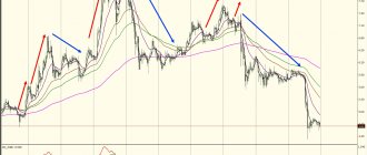
Andrews pitchfork
An Andrews pitchfork extends from an extreme top or bottom to another extreme bottom or top, with the pivot point being the previous extreme bottom or top. The middle line (red) gives the expected mean of the trend. The price will constantly attempt to return to this diagonal.
Each Pitchfork diagonal can be considered a potential reversal zone or support/resistance line. The upper blue diagonal zone is the “most overbought” or the upper boundary of the trend, and the lower blue diagonal zone is the “most oversold” or the lower boundary of the trend.
To build: look for three points, extreme high/low and “oscillating high/low”.
BTC Example
In any given trend, several “pitchforks” can be drawn. Pitchforks should be considered valid if price support/resistance matches the diagonals after the pitchforks have been drawn. Don't try to adjust the pitchforks to the price, but rather choose anchor points and make a decision during the action period.
Examples:
Bollinger Bands are my favorite indicator during flats
One standard deviation above and below the mean. When price consolidates, BBands tighten, a break of the upper or lower ranges signals a BBand breakout or entry signal.
— Default settings = 20, built for use on daily timeframes and liquid markets.
- Setting 30 = Captures more data, may be more appropriate for trading Bitcoin and cryptocurrencies that trade 24/7 rather than 5 days a week (20 days a month)
Example
— Setting 14 = faster setting that captures two weeks of data on a single daily timeframe. Suitable for some market conditions where a faster signal is needed.
False breakouts of Bollinger Bands occur very often and for this reason BBands should not be used without other indicators.
Driving in lanes
— This can happen during a strong bullish or bearish trend continuation
— Usually the main indicator of where the course is moving
Bollinger Band Width (BBW)
Determining the size of the shadow is useful for comparing previous shadows with the active shadow of the candle. If the current shadow is active, I often look at the most recent shadows to determine what a reasonable size for the current one should be.
Oscillators
I never use oscillators alone when making a trading decision. I mainly use them to find divergences
— Average Convergence Divergence (MACD) = trend follows oscillator momentum
– Relative Strength Index (RSI) = measures momentum in price
— Stochastic RSI (Stoch) = faster than RSI
Divers - Cheat Sheet
This tool should be used as additional confirmation of a reversal and not make a decision based solely on it. Divers can gradually develop until they are broken.
— Bullish = lower lows in price on a higher oscillator = weakening bearish momentum
– Bearish = higher highs in price on the lower oscillator = weakening bullish momentum
- Hidden bullish = higher low in price on a lower oscillator = increased bearish momentum has not brought the price down
- Hidden bearish = higher high on higher oscillator = increased bullish momentum did not lower price
What is your mindset?
Many people buy a cryptocurrency and then closely monitor its price, this strategy will turn you into an emotional day trader. Trading or active management is not for everyone. I'm serious, this really isn't for most people. Over 90% of all traders lose their money and fail to stick to a simple buy and hold strategy. If you can't use this style, you will not only lose money, but you will also be wasting your time - which is even more valuable.
Investment
Many people use a buy and hold strategy for Bitcoin, which usually takes several months or years. Some traders use this same strategy for altcoins, but I do not recommend it for most coins. This is a passive strategy that is often used by most people for active management, and is especially loved by new traders.
Trading
This is an active management strategy that can work over any period of time, but the most commonly used are minute, weekly or daily candles. Typically, this process includes several stages in which technical and fundamental analysis can be used.
— Recognition
What do deals with a high probability of success look like? How to find them? On what timeframe, which indicators, oscillator, or chart patterns can I trust?
— Entry, exit and stop loss points
Using your system; where can I open a position, where should the target/close of the position be, how big is my risk?
— Implementation
Follow ideas based on your strategy. Many traders waste time analyzing a market they will never trade in. Theoretical trading or back testing are great for testing your system, but at some point you need to literally invest in your own ideas. The sooner you are connected to the market, the better.
— Trade size
Determining the volume for each trade requires quite a bit of precision and finesse, but can also be a fixed percentage for each trade type or entry type:
I will trade 10% for each new position I will trade 20% based on the chart and add to the position during pullbacks or around key targets/support/resistance.
or by identifying the key goal/support/resistance:
“There is major support around 10,000 based on x, y, z. I'm going to place the majority of my bid at or just below 10,000, but I also want to place a smaller percentage of my bucket above 10,000 to make sure I get into the market."
Trends and their types
A trend is a stable direction in which market prices move. There can be a varying number of trends in a stock chart, but the prevailing pattern of movement will be the trend. It can be of two types: bearish (downward) or bullish (upward). If the preferred direction is not established, then the market does not have a trend, but is in stagnation or consolidation.
Wave-like trends
If we talk about the principles of the formation of Elliott waves, then right now. Trends in stock markets do not develop like lightning; they move accompanied by constant corrective movements, and these can be both micro-movements and serious pullbacks. If the wave-like pattern is broken, then technical analysts talk about a possible trend change.
Trend duration
Technical analysis of stock markets in accordance with the theories of Charles Dow divides trends into short-, medium- and long-term. To fall into the first category and still be considered a trend, it is enough to last a few weeks. The second group includes directed movements from a month to six months; long-term movements are those that exist on the stock market for more than 6 months.
Trend lines
Trend lines are one of the simplest technical tools. Essentially, this is a straight line that runs through the lower points of local minima during an upward movement and through the upper points of local maxima during a bearish trend.
Channels
This is one modification of the use of trend lines. To outline the channel, it is necessary to add the same parallel line to the main trend band, but on the other side of the price range. This limits the levels of possible volatility and provides insight into the trading channel.
Moving average - MA/SMA/EMA/TEMA
Settings - 50, 100, 200, any 2 or more values.
Fast, low slip. average, i.e. 50, closed above the slower slide. the average is a bullish entry signal. A close below the slow moving average is a bearish entry signal.
Slow, high moving average, i.e. 200, closed above a faster slide. average is a bearish entry signal. Close below faster slide. the average is a bullish entry signal.
Golden cross = 50 closed above 200 – Beginning of a Bullish trend
Deadly cross = 50 closed below 200 - Beginning of a Bearish trend.
Reading the scales
The bottom scale in any graph shows the time. Time during which the price changed:
The scale on the right shows the price of one unit of a financial instrument.
For example, one dollar costs 0.89811 Swiss francs.
One Gazprom share now costs 226.92 rubles.
Let's move on.
Fractals
Fractals can be any repeating pattern on a chart. Patterns and harmonics are examples of well-known repeating fractals.
I mostly use random repeating fractals as a weak prediction of future results over a large timescale, but I personally don't use them as actionable signals without using additional tools.
Support and resistance
Technical support and resistance in the stock market can be recognized as local extremes or any other points or price ranges in which there was selling pressure or an increase in the desire of buyers to purchase an instrument.
The magic of round numbers
These are certain psychological levels that are very quickly evident. For example, a level of 100 or 200 rubles. a promotion will always attract the attention of more traders than the price of 34 or 67 rubles. It has been statistically proven that trading volumes increase greatly at such points. However, whether buying or selling will prevail is a closed question, because each participant in the stock market pursues his own goals.
Role reversal
Breaking through one of the technically important levels, as a rule, changes the role of this level to the opposite. Suppose there was a circular resistance of 100 rubles on the chart. per share, which protected bearish positions. After it passes, it becomes a support that will stand on the side of the bulls. The same applies to trend lines.
Channel of support and resistance
This is the range of price volatility, which is limited by support and resistance lines. Many traders often build their strategy precisely within such technical channels, buying from its lower limits and fixing near the upper limits.
Removing unnecessary elements
Once you have decided on the financial instrument and time interval, you need to make the chart readable. Remove from it all those elements that you do not plan to use.
For example, this chart here has a default grid, a MACD indicator window, and a one-click trading window.
I don't need any of this right now. These elements prevent me from looking at the chart. I right-click on the indicator and remove it.
I right-click on the chart and delete the grid and trading window in one click.
The result is a clean graph that will be much easier for me to analyze.